Español
 Français
 English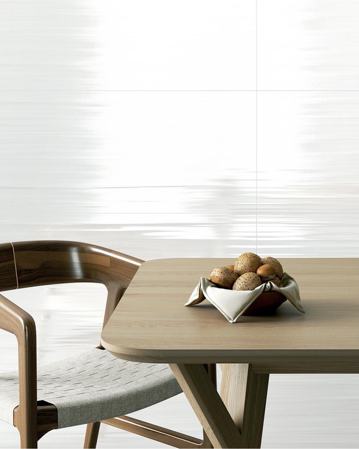

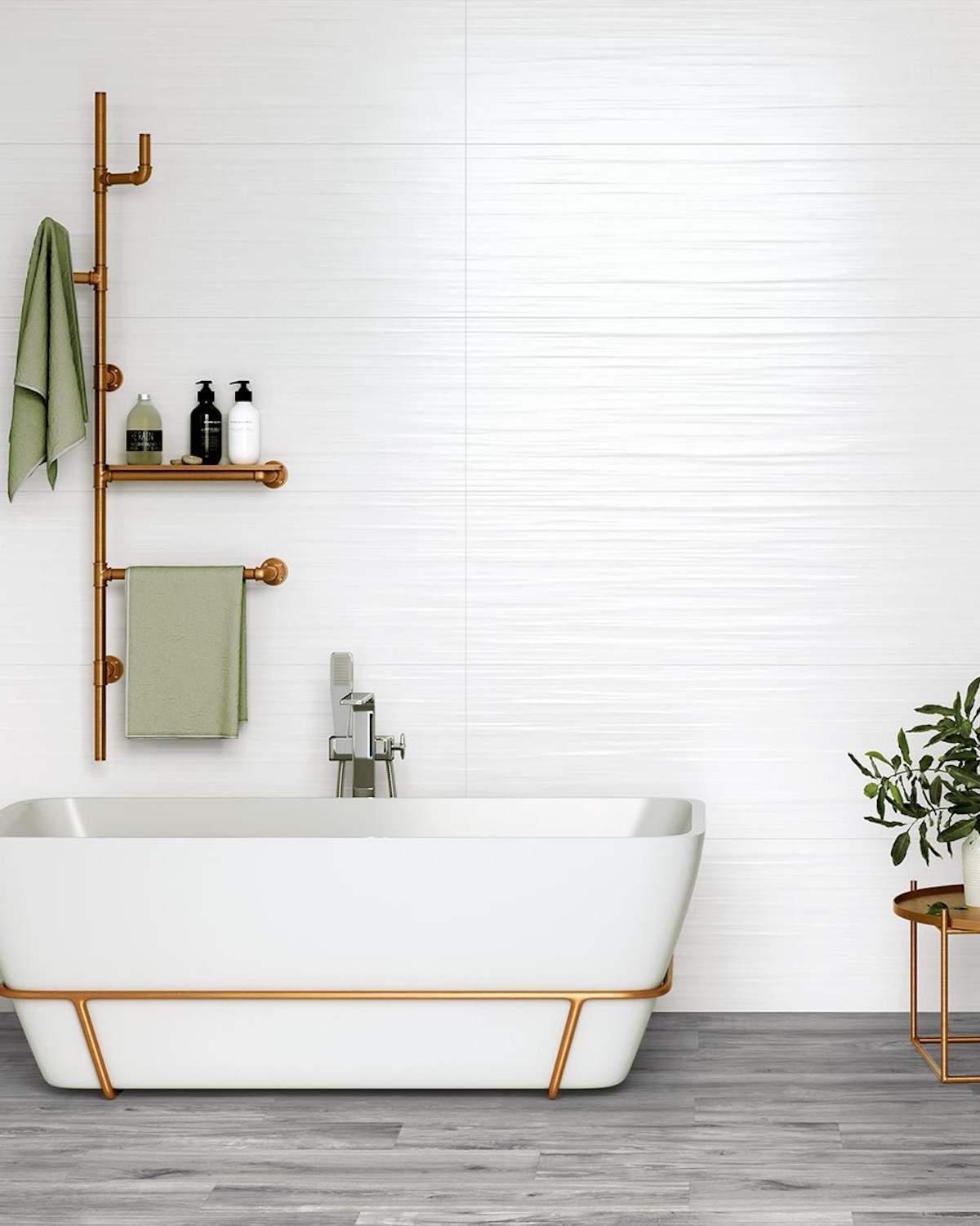
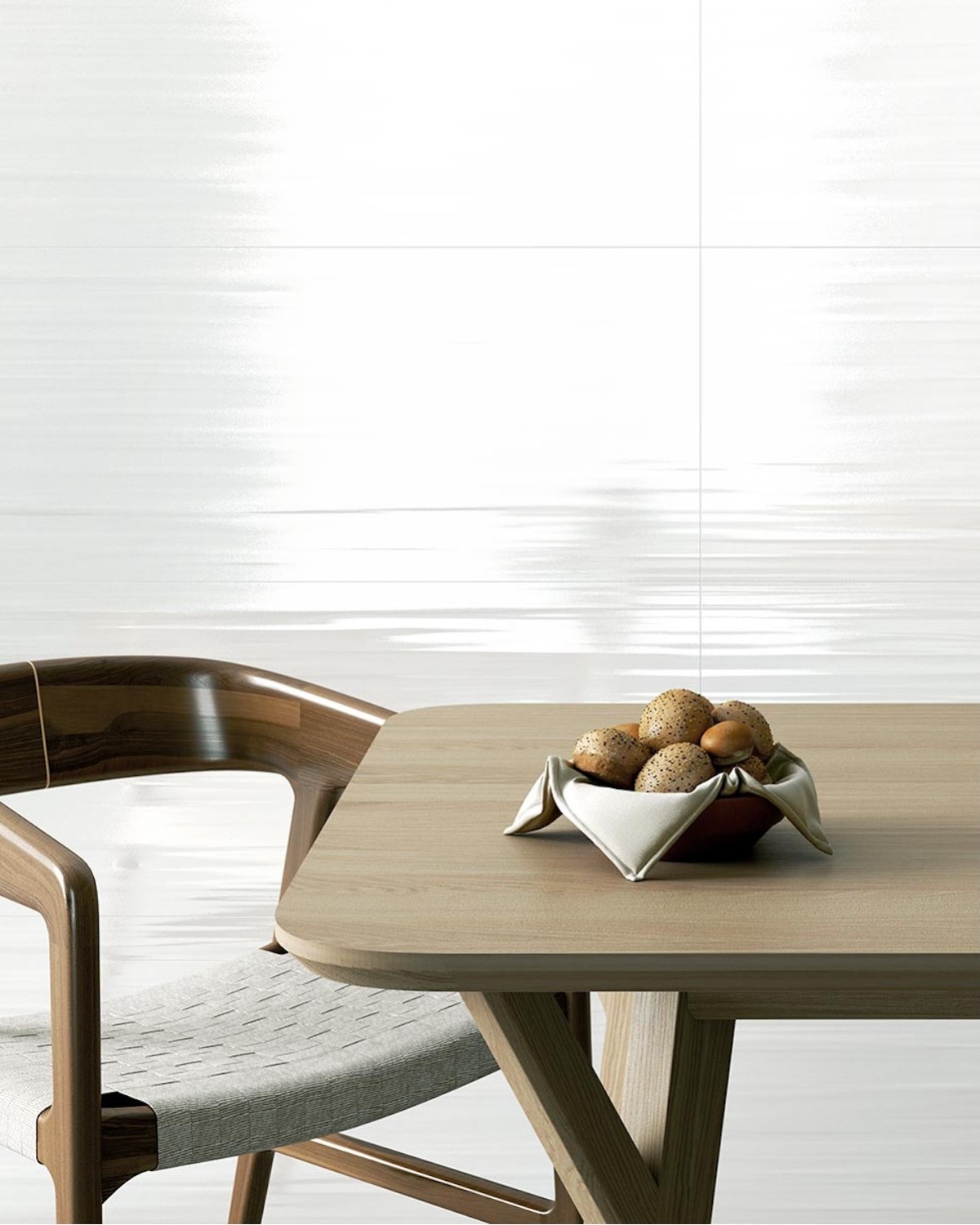
The Alaska 39.6x119.6 white wall tile by Colorker develops a serene, bright and essential aesthetic inspired by the purity of snow. The Alaska collection forms part of the White Colours range by Thinck and offers two models, Alaska Austral and Alaska Andes, both in the 39.6x119.6 cm format. Colorker presents the collection as a proposal where neutrality becomes a central element and where rectified edges help create visually continuous surfaces with very discreet grout lines.

 Security policy
All payment options are under SSL certificate with encryption
 Delivery policy
We deliver with a flatbed truck to any destination in Spain, France and Belgium. Consult other dest
The Alaska 39.6x119.6 white wall tile by Colorker develops a serene, bright and essential aesthetic inspired by the purity of snow. The Alaska collection forms part of the White Colours range by Thinck and offers two models, Alaska Austral and Alaska Andes, both in the 39.6x119.6 cm format. Colorker presents the collection as a proposal where neutrality becomes a central element and where rectified edges help create visually continuous surfaces with very discreet grout lines.
This product page groups together the two references in the collection: Alaska Austral 39.6x119.6 and Alaska Andes 39.6x119.6. Both belong to a collection specifically designed as a wall covering and available in gloss and matt finishes.
The result is a proposal for projects seeking white walls with an elegant, architectural appearance that can be integrated easily into different interior-design styles. The absence of intense colours makes Alaska a versatile base for bathrooms, kitchens, bedrooms, living rooms, entrance halls, hotels and commercial spaces.
Alaska draws its inspiration from snow and the sensations associated with white landscapes: calm, brightness, visual purity and a sense of spaciousness. Colorker translates this idea into a ceramic wall covering where white becomes the principal element of the design.
Rather than depending on a strongly marked graphic, Alaska uses neutrality as a decorative resource. This allows the walls to become part of the architecture without competing with furniture, natural materials or decorative elements.
The collection is particularly suitable for projects where the aim is to enhance natural light, reduce visual noise and create a base capable of remaining current over time.
The collection is formed by Alaska Austral and Alaska Andes, both available in the 39.6x119.6 cm format. These are the two references presented by Colorker within the Alaska collection.
This dual proposal makes it possible to introduce variation within the same family of whites without abandoning overall aesthetic coherence. Austral and Andes can be used according to the visual effect required in each room.
Both models can also be distributed across different spaces within the same project to maintain a common identity based on white, brightness and continuity.
Alaska Austral 39.6x119.6 forms part of the white range within Alaska and is designed as a wall covering for vertical surfaces. Its elongated format makes it possible to create broad, ordered walls with a contemporary module.
It can be used as the principal wall covering within a room or reserved for one selected wall. The neutrality of white allows it to combine with wood-, stone-, cement- or marble-effect floors, as well as stronger colours.
In bathrooms and kitchens, Austral can act as a bright base for timber furniture, black taps, warm metals or more graphic surfaces.
Alaska Andes 39.6x119.6 completes the collection alongside Austral. It shares the same format and the same philosophy centred on white as an element of calm and continuity.
Its use makes it possible to create visually clean walls, particularly when combined with grout in a shade close to that of the wall tile.
Andes can be incorporated into minimalist interiors as well as warmer or more sophisticated spaces, depending on the materials and colours used throughout the rest of the project.
The 39.6x119.6 cm format has elongated rectangular proportions that make it possible to cover large surfaces with fewer visible grout lines than smaller formats. Alaska is produced in this size for both Austral and Andes.
Horizontal installation reinforces the visual width of the wall and is suitable for bathrooms, kitchens, living rooms and longitudinal spaces.
Vertical installation can be used to emphasise height and create a more slender appearance, especially in showers, narrow walls, basin areas and commercial projects.
One of the aspects highlighted by Colorker in Alaska is its rectified finish. The precision of the edges helps reduce the visual presence of grout lines and reinforces the sense of continuity across the complete surface.
In a collection based on white, this effect is especially important because coordinated grout can blend very discreetly into the wall.
The result is a cleaner and more architectural surface, suitable for interiors where visual fragmentation should be reduced as much as possible.
The Alaska collection is available in gloss and matt finishes.
The gloss finish enhances light reflection and can be particularly attractive in small bathrooms, kitchens or interiors where the objective is to increase the sense of brightness.
The matt finish provides a calmer and more restrained appearance. It reduces reflections and makes it easier to combine Alaska with timber, stone, cement, fabrics and other natural-looking materials.
White is one of the most effective resources for enhancing the perception of light and spaciousness. Alaska uses this quality to create walls that act as bright and balanced backgrounds.
In smaller spaces, white wall tiles can help reduce the feeling of enclosure. In larger rooms, they create a clean base onto which stronger furniture and decorative elements can be introduced.
Natural light changes the perception of white throughout the day, while artificial lighting makes it possible to control whether the room appears warmer or more neutral.
The bathroom is one of the spaces where Alaska can best express its aesthetic. The 39.6x119.6 format allows broad walls to be covered and continuous compositions to be created around basins, showers and baths.
Using white helps enhance brightness and introduces a sense of visual cleanliness. It can be combined with neutral flooring or contrasted with timber, dark stone or cement-effect porcelain tiles.
The choice between gloss and matt makes it possible to adapt the final result to the style of the project, from brighter and more sophisticated interiors to softer and more natural compositions.
In showers, the rectangular format helps visually reduce the number of grout lines and create a more continuous surface. Vertical installation can emphasise height, while horizontal installation can visually widen the wall.
Alaska can be combined with transparent shower screens to preserve the sense of spaciousness and with black taps to introduce a contemporary contrast.
Chrome maintains a brighter image, while brass or other warm metals introduce a more sophisticated touch.
An Alaska wall behind the basin provides a neutral base for mirrors, wall-mounted furniture and lighting systems.
Timber furniture adds warmth. White furniture creates a more uniform composition. Black introduces a graphic and contemporary contrast.
In bathrooms with double basins or wide vanity units, the 39.6x119.6 proportions work particularly well with the horizontal lines of the overall composition.
Alaska’s snow-inspired concept and neutral character fit naturally into bathrooms designed as spaces of calm and wellbeing.
Behind a bath, the white wall covering can act as a clean background for a composition focused on lighting, fabrics and natural materials.
Pale timber, woven fibres and beige shades help soften the white and create a warmer atmosphere.
Alaska can be used in kitchens to create bright walls that coordinate easily with furniture in different colours.
White cabinetry maintains a minimalist aesthetic. Timber introduces warmth. Black creates contrast. Greens, blues and earth tones add colour without competing with the wall covering.
The elongated format is particularly suitable for complete walls or areas where a broad and ordered module is required.
In kitchens open to the living or dining room, Alaska can act as a neutral surface that does not compete with the flooring or furniture used throughout the rest of the daytime area.
Its white shade makes the transition towards interiors featuring timber, stone, cement or other materials easier.
This neutrality helps maintain a common visual language between spaces with different functions.
Alaska can also be used on living-room walls when a ceramic alternative to traditional paint is required.
The 39.6x119.6 format creates a surface with a strong architectural presence, while the white colour keeps the aesthetic restrained. The result can act as a background for furniture, lighting, decorative artwork or audiovisual elements.
Combining it with timber and natural fabrics prevents the room from appearing excessively cold and helps create a more welcoming atmosphere.
In bedrooms, Alaska can be used on the headboard wall or on one selected surface to create a clean and timeless base.
White combines easily with fabrics in different colours and allows the decoration to evolve over time without requiring the wall covering to be changed.
Beige, sand, terracotta, green, blue, grey and timber can all be incorporated easily into an interior based on Alaska.
A white wall covering in an entrance hall helps enhance brightness and creates a first impression of order and spaciousness.
Alaska can be used as a background for a console table, mirror or decorative lighting without reducing the prominence of these elements.
In smaller entrance areas, its pale shade can help avoid an excessively heavy visual effect.
The neutrality of Alaska makes the collection suitable for hotel rooms, bathrooms, reception areas and other interior spaces where a clean and timeless image is required.
White makes it easy to create different atmospheres through furniture, lighting and fabrics while maintaining a common base across different rooms.
The elongated format and rectified edges help create visually more continuous walls and are well suited to projects where the architecture needs to convey order and precision.
Alaska can be used in shops, offices, beauty centres, reception areas and other professional interiors where a white surface allows furniture, products or corporate identity to stand out.
The absence of a dominant graphic prevents visual interference and makes it easier to introduce corporate colours.
Lighting can be used to change the perception of the finish and create brighter or calmer interiors according to the needs of the project.
The relationship between white and timber is one of the most versatile combinations in interior design. Timber adds warmth and texture, while Alaska provides brightness and neutrality.
Pale oak creates a Nordic and natural aesthetic. Walnut and darker woods introduce a more elegant contrast.
Timber can appear in furniture, doors, wall panels, worktops, shelving or flooring.
Alaska can be combined with wood-effect porcelain tiles when a ceramic flooring solution is required while maintaining a warmer overall aesthetic.
Pale tones preserve a soft and bright image, while darker woods create a stronger relationship with the white wall covering.
This combination is particularly suitable for bathrooms, bedrooms, kitchens, hotels and commercial interiors.
Black creates a direct contrast with Alaska and helps define the main elements of the space. It can be introduced through taps, shower screens, profiles, mirrors, lighting and furniture.
The result is a graphic and contemporary composition where white acts as the background and black defines the principal lines.
In smaller interiors, the quantity of dark elements should be controlled to preserve the sense of spaciousness.
Alaska can be used alongside stone- and marble-effect floors or surfaces. The neutrality of white allows the veining and nuances of these materials to become more prominent.
White marbles create bright and sophisticated compositions. Beige stones introduce warmth. Grey and black surfaces create stronger architectural contrasts.
This relationship allows Alaska to act as a balancing element in projects featuring materials with greater graphic richness.
Cement effect introduces a more urban and contemporary character alongside the white surface of Alaska.
Pale cement tones maintain a soft and uniform palette. Medium and darker greys create greater differentiation between floors and walls.
The combination can be used in bathrooms, kitchens, commercial interiors and industrial- or minimalist-inspired projects.
Brass, bronze and golden finishes add warmth against a white background. They can be introduced through taps, lighting, profiles, mirrors and accessories.
These details create points of interest and provide a more sophisticated appearance without the need to introduce intense colours on the walls.
Using metals in moderation helps preserve the balance and visual simplicity characteristic of Alaska.
White accepts almost any colour combination. Alaska works especially well with sand, beige, green, blue, terracotta and earth tones.
These shades can be introduced through furniture, fabrics, paint, decorative elements or plants.
The white base makes it easy to update the interior and change the decoration without replacing the principal wall covering.
The philosophy of Alaska fits especially well with minimalist interiors, where reducing the number of materials and colours forms part of the design.
The white surface can become a continuous base accompanied by furniture with simple lines, integrated lighting and a limited selection of materials.
The rectified edges reinforce this appearance by visually reducing the presence of grout lines.
Alaska can also be incorporated into Mediterranean interiors through its combination with timber, woven fibres, handcrafted ceramics and warm colours.
White recalls the bright walls characteristic of Mediterranean architecture, while natural materials prevent the interior from appearing excessively cold.
Plants, linen and earth tones complete a relaxed and natural composition.
The combination of white, pale timber and neutral fabrics allows Alaska to be used in Nordic-inspired interiors.
The brightness of the wall covering helps create visually light spaces, while timber provides the contrast required to introduce warmth.
Soft greys, beige and natural shades can be used as secondary colours.
Horizontal orientation creates a wider visual reading of the wall and can be used on longitudinal surfaces.
It is particularly suitable behind bathroom furniture, worktops, baths and living-room walls where horizontal lines dominate.
The layout should consider the position of grout lines to avoid excessively narrow cuts in corners and junction areas.
Vertical installation emphasises height and can be used in showers, on narrow walls, in entrance halls and on other surfaces where verticality should be reinforced.
This orientation can also introduce a more contemporary character and differentiate the project from a more conventional horizontal layout.
Before installation begins, the distribution of the pieces and the final position of the cuts should be checked.
Alaska’s rectified edges allow a visually precise module to be created. Rectification reinforces the sense of continuity and greatly reduces the visual presence of grout lines.
Grout in a shade close to white helps maintain this effect and prevents each tile from being excessively defined.
A contrasting grout colour would completely change the appearance and turn the module into part of the overall design.
The elongated format requires preliminary planning to distribute the pieces correctly and avoid narrow cuts in visible areas.
Doors, corners, taps, electrical fittings, niches and fixed furniture should be considered before installation begins.
Detailed planning helps achieve a more balanced and professional result.
The substrate must be stable, clean, dry and correctly levelled before the wall covering is installed.
An even surface is especially important when working with elongated pieces to maintain correct alignment between the tiles.
Installation materials should be selected according to the substrate and the specific conditions of the room, following the instructions of their manufacturers and the professional responsible for the installation.
To calculate the order, measure the complete surface to be covered and add an additional allowance for cuts, possible breakage during installation and future repairs.
The extra quantity will depend on the geometry of the wall, the number of corners, doors, niches and other elements requiring cut-outs.
Keeping several pieces from the same batch after the work is completed is recommended to make possible future repairs easier.
Ceramic wall tiles are generally sold in complete boxes. The final purchased quantity may slightly exceed the calculated net surface because of the contents of each package.
The order should be calculated taking into account both the surface to be covered and the allowance planned for cuts and possible replacements.
Before confirming the purchase, the total quantity should be checked to avoid running out of material during installation.
Before installation begins, the box labels should be checked to confirm that the reference corresponds to Alaska Austral or Alaska Andes according to the ordered product.
The selected finish should also be verified, especially because both gloss and matt versions are available within the collection.
The pieces should be inspected before installation and material presenting an unacceptable visible issue should not be fitted.
After installation, adhesive and grout residues should be removed correctly.
The cleaning products used must be compatible with the ceramic wall covering and with the selected finish, whether gloss or matt.
Appropriate cleaning restores the true appearance of the white surface and allows the visual continuity of the wall covering to be appreciated correctly.
For everyday maintenance, products suitable for ceramic surfaces should be used and substances or tools capable of altering the finish should be avoided.
On white surfaces, regular cleaning helps preserve the sense of brightness and visual clarity.
The required frequency will depend on the room, its use and its exposure to moisture, grease or dirt.
The Alaska 39.6x119.6 white wall tile by Colorker offers an elegant and contemporary interpretation of white inspired by the purity of snow. The collection is formed by Alaska Austral and Alaska Andes, both developed in the 39.6x119.6 cm format.
Its rectified edges support a visually continuous surface and reduce the presence of grout lines, while the availability of gloss and matt finishes makes it possible to adapt the final appearance to different interior-design styles.
Alaska is particularly suitable for bathrooms, kitchens, bedrooms, living rooms, entrance halls, hotels, shops and projects where brightness, calm and neutrality are required through a large-format white wall covering.
Data sheet
No customer reviews for the moment.
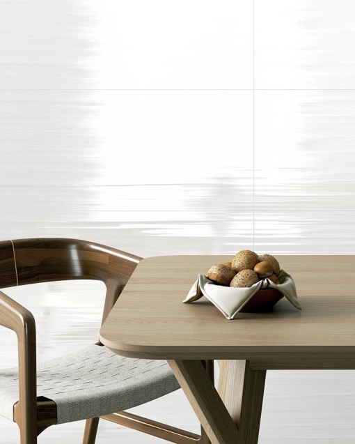
The Alaska 39.6x119.6 white wall tile by Colorker develops a serene, bright and essential aesthetic inspired by the purity of snow. The Alaska collection forms part of the White Colours range by Thinck and offers two models, Alaska Austral and Alaska Andes, both in the 39.6x119.6 cm format. Colorker presents the collection as a proposal where neutrality becomes a central element and where rectified edges help create visually continuous surfaces with very discreet grout lines.