Español
 Français
 English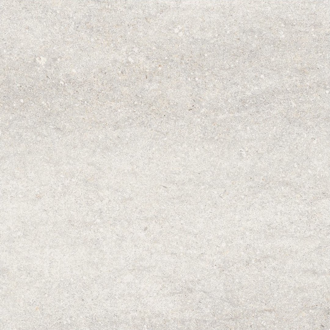
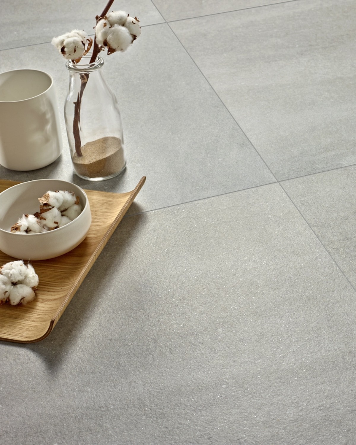
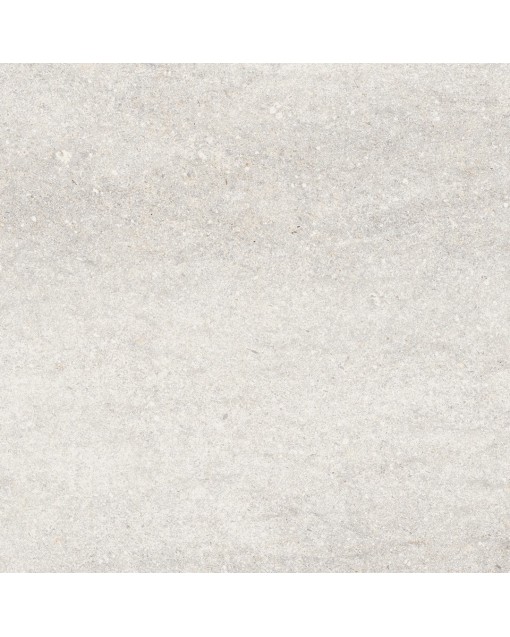
The Kawaii 59.5x59.5 matt porcelain floor tile by Colorker Synergy reinterprets the appearance of stone through a balanced, contemporary surface that integrates easily into both residential and professional projects. Its design combines mineral nuances, natural-looking graphics and a colour palette made up of Moon and Grey.
 Security policy
All payment options are under SSL certificate with encryption
 Delivery policy
We deliver with a flatbed truck to any destination in Spain, France and Belgium. Consult other dest
The Kawaii 59.5x59.5 matt porcelain floor tile by Colorker Synergy reinterprets the appearance of stone through a balanced, contemporary surface that integrates easily into both residential and professional projects. Its design combines mineral nuances, natural-looking graphics and a colour palette made up of Moon and Grey.
This product page is devoted exclusively to the Kawaii 59.5x59.5 cm porcelain format included in Colorker Synergy. The 31.6x100 wall tiles and the Nara and Yugen decorative pieces belong to the general Kawaii collection, but they are not part of this product or its specific commercial conditions.
Separating the 59.5x59.5 format makes it possible to apply a differentiated pricing structure and progressive quantity discounts. Customers who need to purchase a larger number of square metres can therefore access more competitive conditions without mixing this product with other sizes or references from the collection.
Kawaii was created as a creative interpretation of stone. Its surface does not attempt to reproduce one specific rock literally, but instead develops its own mineral aesthetic through graphic variation, soft nuances and a calm appearance.
The result is a tile that can act as a neutral background while still adding personality. Its graphic avoids complete uniformity and creates a surface with visual depth, suited to interiors where natural character is desired without relying on excessively pronounced veining.
This combination makes Kawaii suitable for minimalist, Mediterranean, Nordic, industrial, urban and nature-inspired interiors. The product adapts to each project through the furniture, lighting and materials with which it is combined.
The 59.5x59.5 cm format has especially versatile square proportions. Its size makes it possible to cover broad surfaces with an ordered grid and a visually controlled number of grout lines.
It does not reach the dimensions of very large formats, which can be more complex to handle, but it offers a more continuous appearance than smaller tiles. This balance makes it suitable for homes, complete renovations, shops, hotels, restaurants and large-surface projects.
In regular rooms, straight installation reinforces architectural order. In open-plan spaces, the format visually connects the living room, dining area, kitchen and circulation zones through the use of one continuous floor.
Including Kawaii 59.5x59.5 in Colorker Synergy allows this format to be presented under specific commercial conditions. The product remains part of the Colorker Kawaii collection, but it has its own discount tiers linked to the purchased quantity.
This product page does not group together every piece from the collection. It focuses only on the 59.5x59.5 matt porcelain tiles in Moon and Grey because these are the selected references offered under Synergy conditions.
This separation prevents the discounts for this format from being incorrectly applied to the 31.6x100 wall tiles or decorative pieces. It also allows customers to clearly identify the product, size and price corresponding to their order.
One of the principal advantages of Colorker Synergy is the possibility of obtaining special prices according to the number of boxes or square metres purchased. As the quantity increases, the price per square metre may improve according to the tiers shown on the product page.
This structure is especially attractive for complete renovations, entire homes, property developments, commercial premises, offices, restaurants, hotels and projects where a substantial surface needs to be covered.
To display the correct price, the full required quantity should be entered within the same purchase. Dividing the material into several orders may prevent the overall volume from reaching the corresponding discount tier.
Kawaii 59.5x59.5 porcelain tiles are available in Moon and Grey. Both share the same stone-inspired identity while producing different results in interior design.
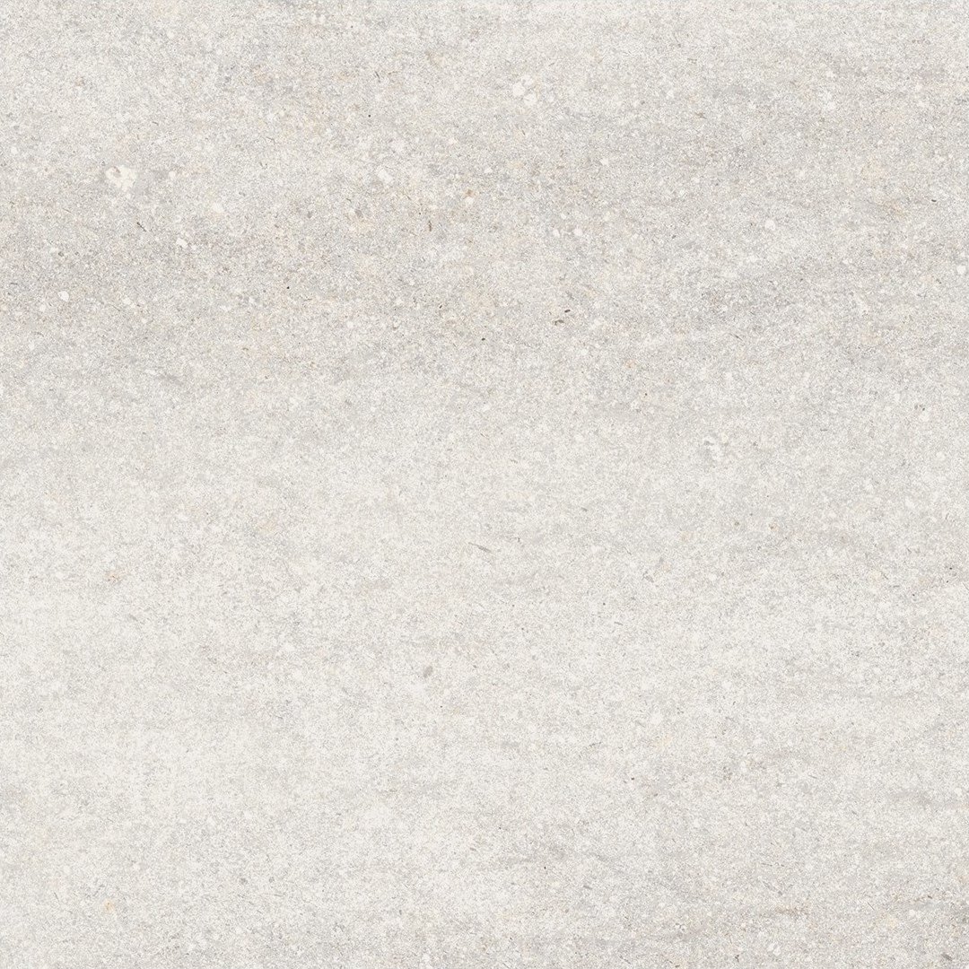
Moon creates a lighter and brighter appearance. It supports spacious, soft and balanced interiors, especially when combined with timber, warm whites, natural fibres and furniture in neutral shades.
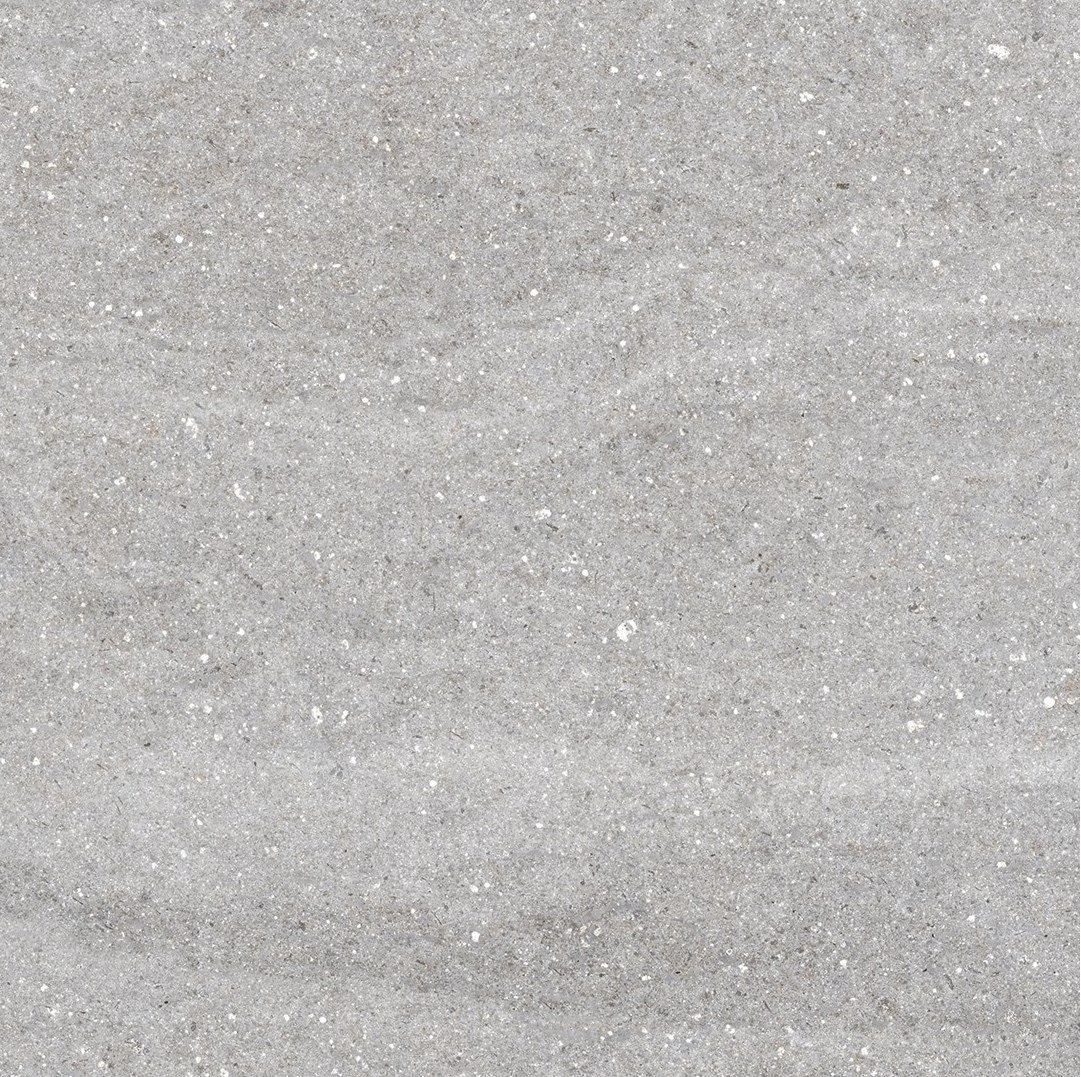
Grey introduces a more mineral and urban presence. Its grey tone works with pale timber, black, steel, cement, stronger colours and contemporary decorative elements.
Kawaii Moon 59.5x59.5 offers the brightest version of the flooring. Its pale tone helps enhance light and visually enlarge rooms without relying on a completely white surface.
The mineral nuances add depth and prevent the result from appearing overly flat. Moon can therefore be used in living rooms, bedrooms, kitchens, bathrooms, entrance halls and commercial spaces where a neutral base with greater visual richness is required.
Moon combines especially well with pale oak, beech, ash, natural fabrics, beige stone and sand tones. It also accepts black or metallic elements when a more defined contrast is desired.
Kawaii Grey 59.5x59.5 develops a grey shade capable of creating restrained, current and architectural interiors. Its colour acts as a neutral base and allows pale, dark or more intensely coloured furniture to be incorporated.
Combined with timber, grey takes on a warmer appearance. With black metal and cement, it reinforces an industrial aesthetic. Together with white and soft fabrics, it creates balanced interiors without losing depth.
Grey is suitable for contemporary homes, offices, shops, restaurants and spaces requiring discreet flooring with a clearly recognisable mineral presence.
The matt finish reinforces the stone-inspired character of the collection. The absence of intense reflections allows the surface nuances to be appreciated in a more natural and restrained way.
This finish combines easily with timber, stone, cement, paint, fabrics and metal. The tile integrates with the architecture without becoming an excessively reflective surface.
The appearance of Moon and Grey may vary slightly according to natural or artificial light, but the matt finish maintains a calm reading throughout the day.
Kawaii 59.5x59.5 is made from porcelain stoneware and can be used on both floors and walls. This versatility makes it possible to coordinate different surfaces within the same room.
In bathrooms, the same product can be installed on the floor and continued onto a wall, around the basin or inside the shower. In living rooms and entrance halls, it can be used as flooring and repeated vertically on a feature wall.
Material continuity reduces visual interruptions and helps create more spacious interiors, particularly in contemporary projects and open-plan rooms.
In living and dining rooms, Kawaii creates a neutral base that allows furniture, fabrics and decorative colours to be changed without replacing the floor. Its stone inspiration introduces natural character, while the square format preserves a balanced layout.
Moon is suited to bright living rooms and softer atmospheres. Grey adds greater depth and can be used to create more urban or sophisticated spaces.
When the living room connects with the dining area or kitchen, retaining the same flooring supports continuity and avoids unnecessary fragmentation between the different zones.
Kawaii 59.5x59.5 can be used in kitchens with very different styles. The neutrality of Moon and Grey makes them easy to combine with white, black, green, blue, beige and natural timber cabinetry.
Moon helps create brighter and lighter kitchens. Grey adds a stronger and more contemporary image, especially when paired with pale worktops, steel, timber or black profiles.
In open-plan kitchens, the porcelain flooring can extend into the living and dining areas. This continuity creates a common base on which the different functions of the space can be organised.
In bathrooms, Kawaii creates mineral-inspired surfaces with a calm and contemporary appearance. The 59.5x59.5 format can be used on the floor and continued across one or more walls to achieve an enveloping composition.
Moon is especially attractive in small bathrooms or rooms with limited natural light. Grey can highlight the shower, basin wall or a selected surface without requiring additional decorative motifs.
Black fittings create contrast, chrome maintains a bright image and brass introduces warmth. Timber helps soften the mineral character of both shades.
Stone-effect flooring can also be used in bedrooms when a neutral and continuous base is desired. Moon introduces brightness and works with pale fabrics, natural fibres and timber furniture.
Grey supports a more enveloping and contemporary atmosphere. It can be combined with white, green, blue, earth tones and black elements.
The same flooring can continue from the bedroom into a dressing room, corridor or en-suite bathroom, reinforcing the visual connection between the different areas.
In entrance halls and circulation zones, Kawaii offers an ordered appearance that is easy to coordinate with the rest of the property. The square format creates a regular sequence, while the stone nuances introduce visual variation.
Moon helps increase brightness in narrow corridors. Grey adds greater depth and can be combined with pale walls to maintain good balance.
Timber console tables, mirrors, metal lighting and planting complete the composition without competing with the flooring surface.
Kawaii 59.5x59.5 can also be used in shops, offices, restaurants, hotels and customer-facing interiors. Its neutral appearance allows furniture, displayed products and the visual identity of the establishment to stand out.
Moon supports bright and open interiors. Grey introduces a more urban and architectural image. Both colours can be combined with timber, metal, glass and surfaces with different finishes.
Colorker Synergy quantity conditions can be particularly attractive for this type of project, where the total surface may allow higher discount tiers to be reached.
Timber balances the mineral appearance of Kawaii and adds warmth to the composition. It can appear in furniture, doors, wall panelling, worktops or decorative features.
Pale oak combines with Moon to create soft and bright interiors. Alongside Grey, it creates a natural contrast that reduces the coolness of the shade.
Darker woods and walnut introduce elegance and can be used in living rooms, bedrooms, kitchens and commercial interiors. The choice depends on the level of contrast required.
Black elements introduce definition and reinforce the lines of the project. They can be added through taps, profiles, shower screens, lighting, furniture and frames.
With Moon, black creates a clear and graphic contrast. With Grey, it produces a deeper and more homogeneous composition. In both cases, adding timber or warm lighting helps balance the interior.
This combination works especially well in bathrooms, kitchens, entrance halls, restaurants and contemporary spaces.
Moon and Grey allow greens, terracotta, blues, beige, off-whites and sand tones to be introduced. These colours reinforce the relationship between the product, stone and natural landscapes.
Moon acts as a background for both soft and intense colours. Grey works particularly well with dark greens, deep blues and rust tones.
Colour can be introduced through paint, furniture, fabrics, plants and accessories while keeping the porcelain flooring as a stable and durable base.
The balanced graphic of Kawaii suits minimalist projects where the number of materials and colours is intentionally reduced. The floor can act as a continuous base alongside plain walls and simple furniture.
Moon creates a brighter and lighter aesthetic. Grey introduces a stronger visual presence without requiring complex decoration.
Coordinated grout, regular installation and carefully planned lighting help maintain a clean and architectural appearance.
Kawaii can also be incorporated into Mediterranean interiors by combining it with timber, woven fibres, handcrafted ceramics, linen and warm colours.
Moon works with white walls, sand tones and pale woods. Grey can act as a mineral counterpoint in interiors dominated by natural materials.
The matt surface reinforces this aesthetic and avoids reflections that could interrupt the calmness of the composition.
Using Kawaii 59.5x59.5 in several areas visually connects the home or project. The same floor can begin in the entrance hall, continue through the living room and extend into the kitchen, bedrooms and corridors.
Avoiding frequent changes of material makes spaces feel larger. It also simplifies the coordination of doors, furniture and decorative elements.
Each room can develop its own identity through paint, fabrics and lighting without changing the principal flooring.
The possibility of using the porcelain tile on both floors and walls allows the surface to continue from the horizontal plane onto a vertical one. This solution can be applied in bathrooms, showers, basin areas, entrance halls and living rooms.
It is not necessary to tile the complete room. One selected wall can act as a background for furniture, a fireplace, mirror or decorative feature.
The distribution of grout lines should be planned to maintain a coherent relationship between horizontal and vertical planes.
Straight installation is the most common option for the 59.5x59.5 format. It creates an ordered grid, simplifies setting out and usually reduces the number of cuts.
The module can be centred in relation to the room, principal furniture or circulation axes. Advance planning avoids excessively narrow pieces along visible perimeter areas.
The graphic direction and distribution of variations should be checked before adhesive is spread across the complete surface.
The square format also allows diagonal installation. This layout introduces movement and can change the perception of small, narrow or irregular spaces.
Diagonal installation normally generates more cuts and requires a greater additional quantity of material than straight installation.
Before choosing this pattern, the room dimensions, access points, door positions and result of perimeter cuts should be studied.
Before installation begins, it is advisable to open several boxes and mix pieces from different packages. This helps distribute the shades and graphic variations evenly.
The tiles can be rotated to alter the direction of the markings and avoid obvious repetition. Installation should not follow only the order in which the pieces appear inside one box.
On broad surfaces, a preliminary layout helps achieve a more natural and coherent result.
The substrate must be stable, clean, dry and correctly levelled. A flat surface is essential for avoiding height differences between pieces and achieving regular flooring.
The adhesive should be selected according to the substrate, intended use and project conditions. Application and installation should follow the recommendations of the manufacturer and the professional responsible for the work.
Installation joints, perimeter joints and any required structural joints must also be respected. Porcelain stoneware should not be installed without separation between the pieces.
A grout shade coordinated with the tile supports a more continuous surface. For Moon, a pale or slightly warm tone can be selected. For Grey, grey grout helps integrate the grid.
Contrasting grout makes each piece more visible and turns the module into a decorative feature. This option may suit graphic projects, but it reduces the continuity associated with the stone effect.
The final colour should be tested on a sample because its appearance may change after drying.
To calculate the order, measure the complete surface and add an allowance for cuts, possible breakage during installation and future repairs.
The percentage will depend on the geometry of the space and the selected pattern. A rectangular room with straight installation usually requires less additional material than diagonal installation or a room with many corners and columns.
It is also advisable to keep several tiles from the same batch after the project is completed to make future repairs easier.
Kawaii 59.5x59.5 is sold in complete boxes. The entered quantity may be automatically adjusted according to the packaging contents, so the purchased total may slightly exceed the calculated net surface.
This adjustment is part of the standard sales system for ceramic products. Customers should consider it when comparing the measured square metres with the final order quantity.
To reach the correct Colorker Synergy discount tier, the complete quantity required for the project should be added.
Ceramic tiles are manufactured in batches, and variations in shade or calibre may exist between separate production runs. It is therefore advisable to purchase all the required material in a single order.
Before installation begins, the box labels should be checked to confirm that the received reference corresponds to the ordered product.
The surface of each piece should also be inspected before installation. Material presenting a visible and unacceptable difference should not be fitted, as installation implies acceptance of the product.
After installation, adhesive and grout residues should be removed correctly. The products used must be compatible with porcelain stoneware and its matt finish.
Abrasive tools and cleaners that may leave films on the surface should not be used. Suitable initial cleaning allows the true appearance of the product to be appreciated.
The recommendations provided by the manufacturers of the installation and cleaning products should be followed throughout the process.
For everyday maintenance, products compatible with ceramic surfaces should be used, avoiding those that leave residues capable of changing the matt appearance.
Cleaning frequency will depend on room use, traffic and the type of dirt present. Kitchens, entrance halls and commercial interiors may require more frequent attention than bedrooms or low-use areas.
Regular cleaning helps preserve the natural appearance of Moon and Grey and keeps the nuances of their stone-inspired graphic clearly visible.
The Kawaii 59.5x59.5 matt porcelain floor tile by Colorker Synergy combines a contemporary stone aesthetic, a versatile square format and specific commercial conditions for larger-volume orders.
The Moon and Grey shades make it possible to create bright, natural, mineral or urban interiors. Its matt finish and suitability for floors and walls support continuous projects in homes, shops and professional spaces.
The exclusive inclusion of the 59.5x59.5 format within Synergy allows progressive discounts to be applied without mixing its conditions with those of the 31.6x100 wall tiles or the Nara and Yugen pieces from the general collection.
It is a particularly attractive option for living rooms, kitchens, bathrooms, bedrooms, entrance halls, hotels, restaurants, offices, complete renovations and projects requiring a substantial quantity of material at progressively more competitive prices.
Data sheet
No customer reviews for the moment.
The Kawaii 59.5x59.5 matt porcelain floor tile by Colorker Synergy reinterprets the appearance of stone through a balanced, contemporary surface that integrates easily into both residential and professional projects. Its design combines mineral nuances, natural-looking graphics and a colour palette made up of Moon and Grey.