Español
 Français
 English
- New
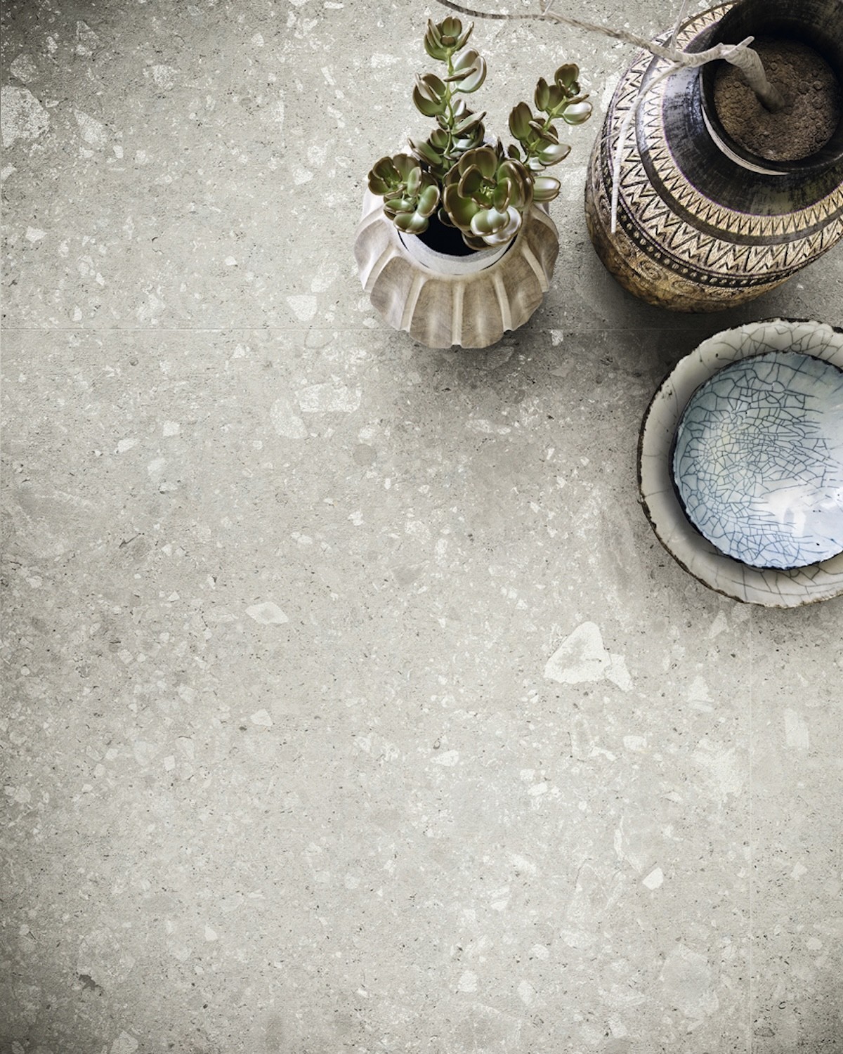
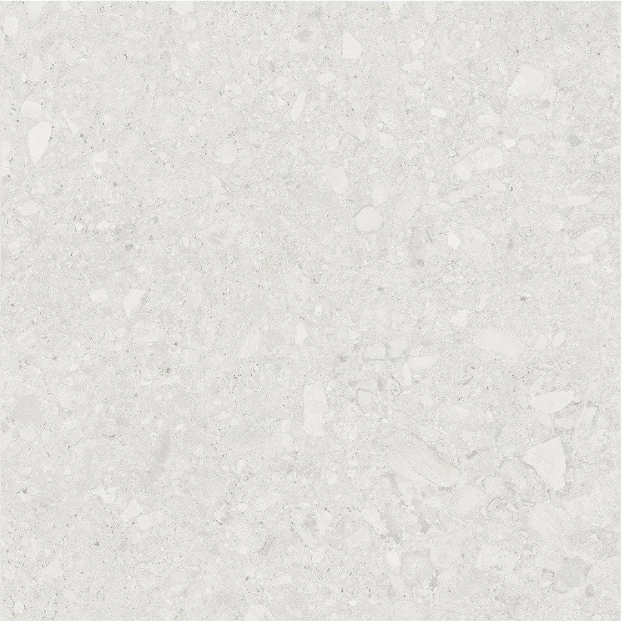
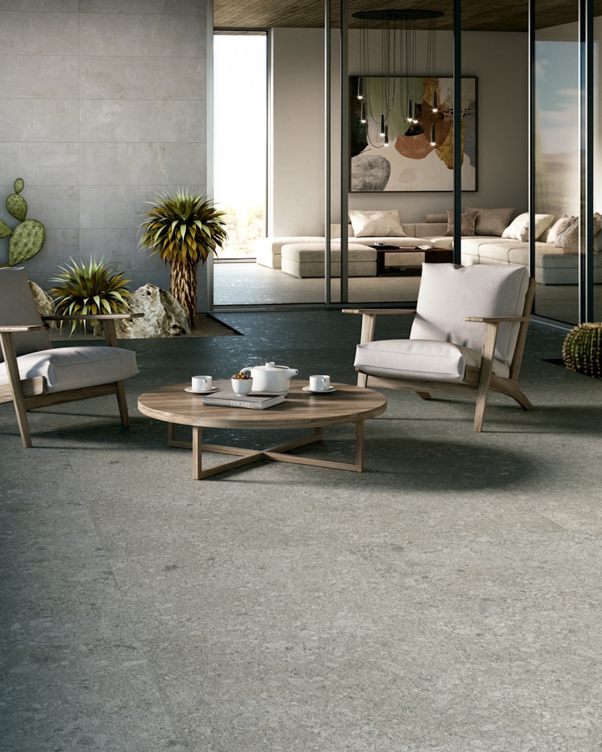
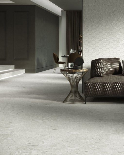
The Native matt stone-effect porcelain tile by Colorker Synergy pays tribute to the mineral elegance of Italian Ceppo di Gré stone, recognisable for the stone fragments embedded throughout its surface. Colorker interprets this natural aesthetic through a contemporary, balanced porcelain collection with considerable graphic richness.
This product page includes all porcelain formats manufactured within the Native collection: 90x90 cm and 59.5x119.2 cm. Both are available in Moon, Grey and Cream, with a matt finish and suitability for floors and walls.
 Security policy
All payment options are under SSL certificate with encryption
 Delivery policy
We deliver with a flatbed truck to any destination in Spain, France and Belgium. Consult other dest
The Native matt stone-effect porcelain tile by Colorker Synergy pays tribute to the mineral elegance of Italian Ceppo di Gré stone, recognisable for the stone fragments embedded throughout its surface. Colorker interprets this natural aesthetic through a contemporary, balanced porcelain collection with considerable graphic richness.
This product page includes all porcelain formats manufactured within the Native collection: 90x90 cm and 59.5x119.2 cm. Both are available in Moon, Grey and Cream, with a matt finish and suitability for floors and walls.
Including the complete collection within Colorker Synergy makes it possible to apply specific commercial conditions and progressive discounts according to the purchased quantity. Customers can therefore select the colour and format best suited to their project while remaining within the same Synergy proposal.
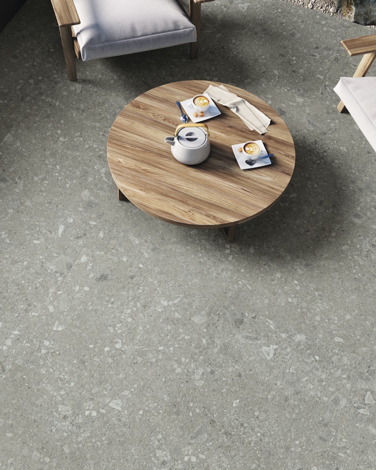
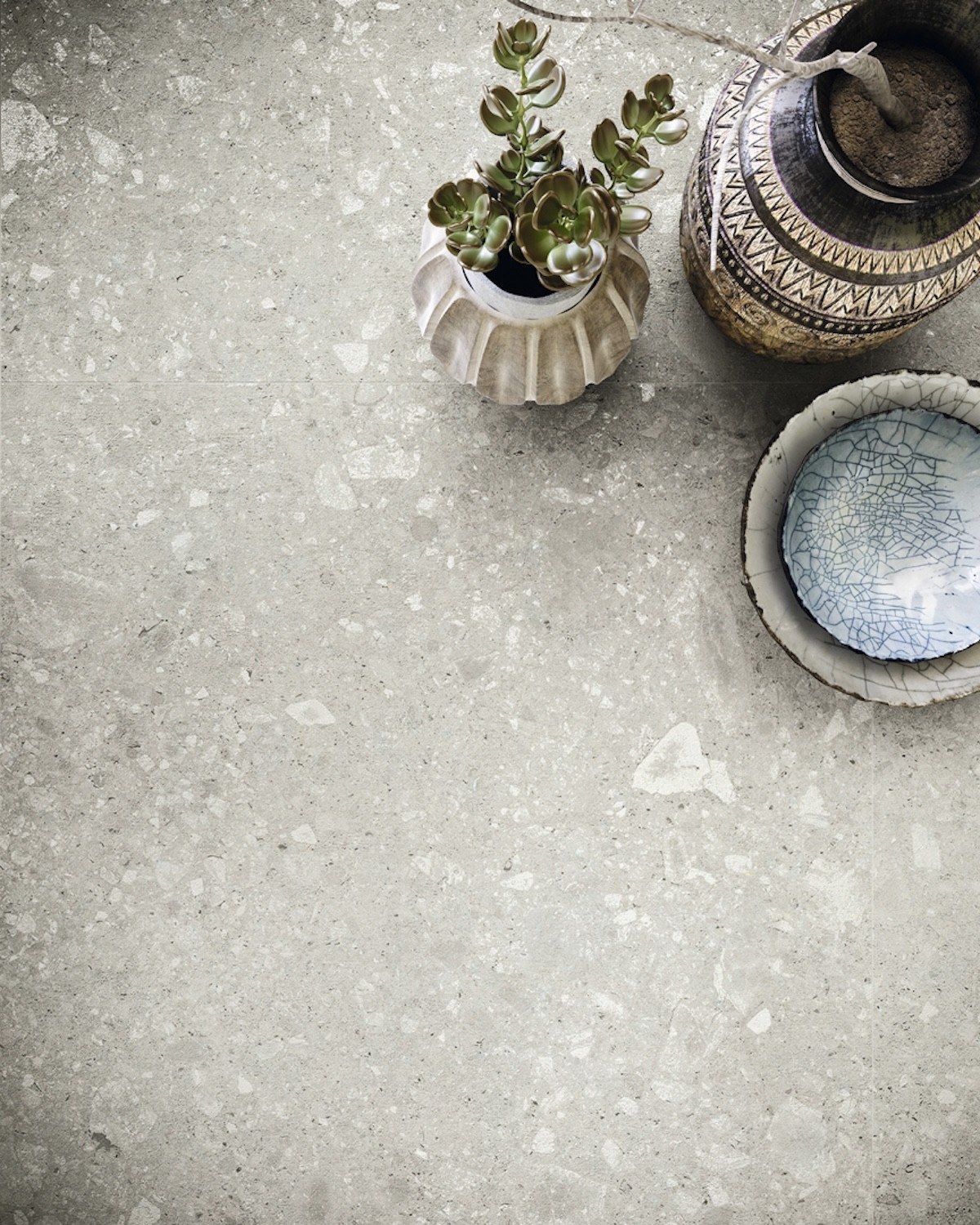
Native takes Ceppo di Gré as its reference, an Italian stone characterised by pebbles, fragments and small mineral inclusions distributed across a compact-looking background.
This visual structure creates a surface with depth and movement. The stone elements appear integrated into the background, forming an irregular composition that avoids excessive uniformity and reinforces the natural character of the product.
Colorker has applied printing techniques that synchronise the graphic with selected surface effects. Thanks to this relationship between design and finish, some of the fragments present on the tile acquire a distinctive shine and become characteristic features of the collection.
The personality of Native does not depend solely on its stone-inspired design. The collection incorporates a precise relationship between the graphic and the effects applied to the surface, allowing selected fragments to be highlighted and creating a richer appearance.
These details are perceived differently depending on the position of the observer and the incidence of light. The surface may appear more uniform from a certain distance and reveal additional nuances when viewed closely.
The result is a stone-effect porcelain tile that retains a restrained and versatile base while introducing enough depth to distinguish it from flatter mineral-inspired designs.
This product page includes the square Native 90x90 cm format and the rectangular Native 59.5x119.2 cm format. Both sizes are available in Moon, Grey and Cream.
The 90x90 format provides a broad and balanced module, suitable for continuous floors and spaces where the number of visible grout lines should be reduced.
The 59.5x119.2 format has rectangular proportions that make it possible to visually direct the space and create both horizontal and vertical compositions.
The 90x90 cm format has large square proportions. Its geometry helps create ordered, visually continuous floors, especially in spacious rooms and open-plan interiors.
The square surface allows the distribution of the stone fragments to be appreciated without making the module appear excessively pronounced. With coordinated grout, the floor develops a uniform and architectural appearance.
It can be used in living rooms, dining rooms, kitchens, bedrooms, entrance halls, offices, shops, restaurants, hotels and other spaces seeking a contemporary mineral aesthetic.
The 59.5x119.2 cm format introduces rectangular proportions that give the design a stronger sense of direction. On floors, it can be installed along the principal axis of the room to reinforce depth or transversely to visually widen narrow spaces.
On walls, the format can be installed horizontally to emphasise width or vertically to increase the sense of height. This flexibility makes it suitable for bathrooms, shower areas, living rooms, entrance halls and feature walls.
Its greater length allows the stone-inspired graphic to develop continuously and gives the fragments inspired by Ceppo di Gré a distinctive visual presence.
Native is available in Moon, Grey and Cream. All three shades share the same mineral inspiration while offering different possibilities for combinations and interior atmospheres.
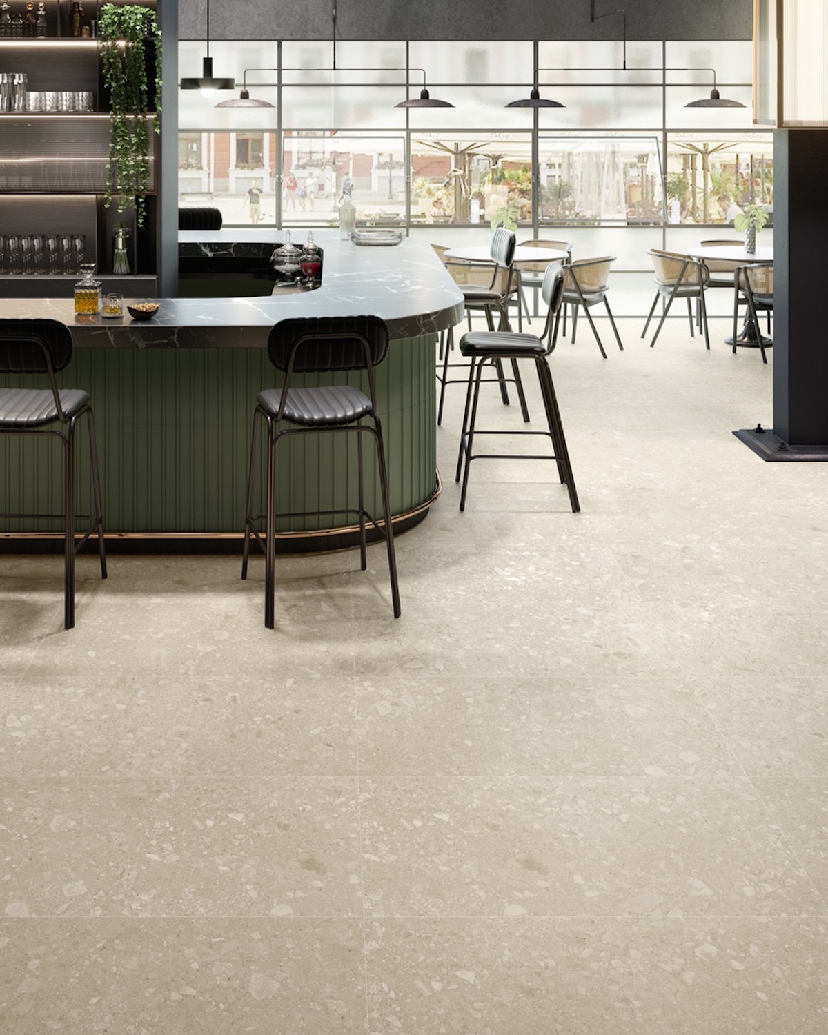
Moon provides a pale and bright base. Grey reinforces the depth of the stone and develops a more urban aesthetic. Cream introduces a warm and natural interpretation that is especially suitable for welcoming interiors.
The choice can be made according to the available light, furniture and overall character of the project. Different shades may also be used in separate rooms while maintaining the same aesthetic identity.
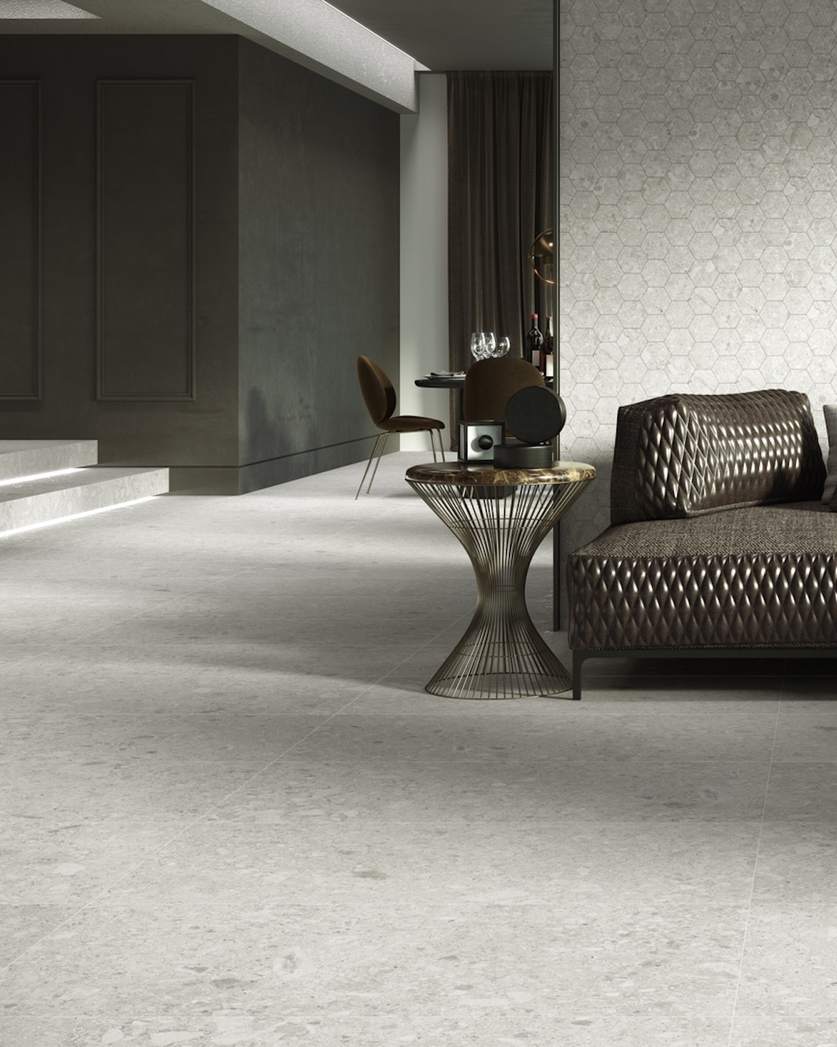
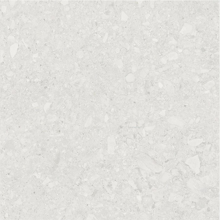
Native Moon is the palest version of the collection. Its shade helps reflect light and creates a greater sense of space without relying on a completely white surface.
The stone fragments introduce contrast and depth, preventing the floor or wall from appearing excessively uniform. The surface retains a soft appearance while preserving the distinctive character of Ceppo di Gré.
Moon combines with pale timber, warm whites, beige, natural fibres, black metal and soft colours. It can also act as a background for furniture in stronger shades.
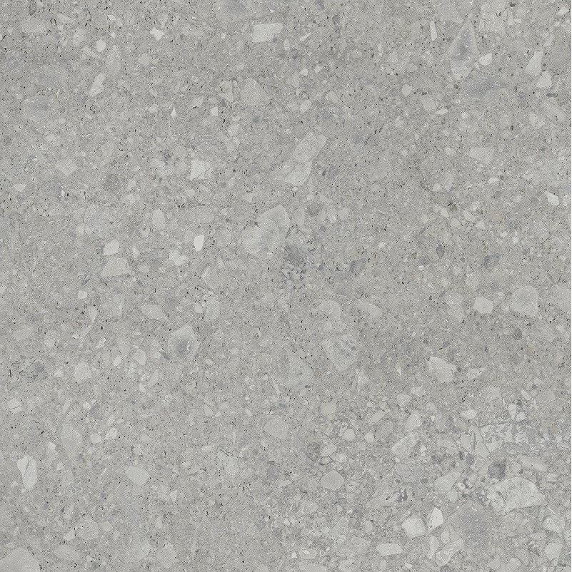
Native Grey develops a grey shade with a clear mineral inspiration. Its colour reinforces the presence of the fragments and creates a deeper, more restrained and architectural appearance.
It is suitable for contemporary, industrial, minimalist and commercial interiors. It can be paired with white to increase contrast, timber to introduce warmth or black to create a more homogeneous composition.
Grey also works as a neutral base for dark greens, blues, rust tones and other stronger colours.
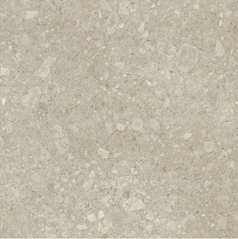
Native Cream presents a warm shade that softens the mineral character of the collection. Its appearance relates to natural stones with beige and creamy nuances.
This option makes it possible to create bright and welcoming interiors, particularly when combined with timber, natural fabrics, off-white, sand tones and warm metals.
Cream is suitable for living rooms, bedrooms, bathrooms, kitchens, hotels and wellness spaces where a stone aesthetic is required without the coolness of grey.
The matt finish reinforces the mineral inspiration of Native and avoids excessively intense reflections across the overall surface.
The synchronised effects applied to selected fragments create subtle contrasts in shine that enrich the composition without turning the complete surface into a glossy finish.
This combination allows the graphic to be appreciated with different levels of depth and makes the porcelain tile easy to combine with timber, paint, cement, metal and fabrics.
Native is manufactured in porcelain stoneware and can be used on floors and walls. This versatility makes it possible to coordinate the flooring with selected wall surfaces and create greater visual continuity.
In bathrooms, the same colour can be installed on the floor and continued into the shower or across the basin wall. In living rooms, it can be used as flooring and repeated on a feature wall.
The possibility of combining two formats within the same collection expands the design options and allows the module to be adapted to the dimensions of each surface.
The inclusion of all Native formats within Colorker Synergy allows the collection to be presented under differentiated commercial conditions linked to purchase volume.
This product page includes Moon, Grey and Cream in 90x90 and 59.5x119.2. Customers can select any of these references according to the aesthetic and dimensional requirements of the project.
Prices and discounts may vary according to the quantity and selected reference. To display the correct tier, the complete required quantity of the corresponding product should be added to the order.
Colorker Synergy makes it possible to apply progressive prices according to the number of boxes or square metres purchased. As the order volume increases, the price per square metre may improve according to the established tiers.
This structure is particularly attractive for complete renovations, entire homes, property developments, commercial premises, hotels, restaurants, offices and large-surface projects.
To reach the corresponding discount, the complete quantity should be entered in one operation. Dividing the material into several orders could prevent the tier associated with the overall volume from being applied.
Native creates a mineral base that can be integrated into living and dining rooms with different styles. The graphic inspired by Ceppo di Gré introduces movement, while the colour range makes it possible to control brightness and contrast.
Moon supports pale and lightweight interiors. Grey introduces a deeper and more urban presence. Cream creates a warm and natural atmosphere.
In open-plan spaces, the same flooring can continue from the living room into the dining area and kitchen, avoiding material changes and reinforcing visual spaciousness.
Native can be used in contemporary, industrial, natural or minimalist kitchens. Its stone appearance combines with white, black, grey, green, blue and timber cabinetry.
Moon helps increase brightness. Grey creates a stronger contrast with pale furniture. Cream combines particularly well with timber and warm whites.
The same porcelain tile can continue into the dining or living area in open-plan kitchens, creating a common base for the complete daytime zone.
In bathrooms, Native makes it possible to develop enveloping surfaces by combining floors and walls. The 90x90 and 59.5x119.2 formats can be distributed according to the dimensions and geometry of each plane.
The rectangular format is particularly suitable for shower walls, basin areas and broad vertical surfaces. The square format provides balanced floor modulation.
Moon introduces brightness, Grey reinforces a more restrained aesthetic and Cream creates a warm atmosphere. Black, chrome or warm metallic fittings can be used to personalise the composition.
Stone-effect porcelain tiles can be used in bedrooms when a continuous and natural-looking surface is desired. Native provides a neutral base that combines with fabrics, timber and decorative colours.
Moon creates bright bedrooms. Grey supports a more enveloping atmosphere. Cream favours warm and calm interiors.
The flooring can continue into dressing rooms, corridors and en-suite bathrooms, reinforcing the connection between the different spaces.
Native creates a solid and ordered appearance from the entrance of a home or commercial interior. The mineral fragments introduce visual interest and allow the flooring to retain personality even in areas with limited furniture.
In corridors, the 59.5x119.2 format can be installed following the direction of travel to reinforce depth. In spacious entrance halls, the 90x90 format creates a larger-scale grid.
Continuing the same floor into the living room, kitchen and other rooms avoids unnecessary breaks and helps make the complete interior appear more spacious.
Native can be used in reception areas, hotel rooms, restaurants, shops, offices and other professional interiors. Its neutral palette allows it to integrate with different visual identities and furniture styles.
The structure inspired by Ceppo di Gré creates a recognisable presence without depending on intense colours or excessively decorative patterns.
Colorker Synergy conditions are particularly attractive in projects where the material volume makes it possible to access more competitive price tiers.
Timber helps balance the mineral character of Native and introduces warmth into the composition. It can be incorporated through furniture, doors, wall panelling, kitchens, worktops and decorative elements.
Pale woods combine especially well with Moon and Grey. Walnut and darker timbers create a more elegant contrast. Cream relates naturally to oak, ash and warm finishes.
Wood-effect porcelain tiles may also be used in areas where a completely ceramic solution is required.
Black can be introduced through taps, profiles, shower screens, lighting, furniture and frames. On Moon, it creates a graphic contrast; with Grey, it produces a deeper composition; and with Cream, it introduces definition.
Steel and chrome create a more technical and contemporary appearance. Brass and bronze introduce warmth, particularly when combined with Native Cream.
The proportion of dark elements should be adapted to the brightness and dimensions of each space.
Native can be combined with greens, blues, terracotta, off-whites, beige and earth tones. These palettes reinforce the relationship between the collection, stone and natural landscapes.
Moon accepts both soft and strong contrasts. Grey works particularly well with deep greens, dark blue and rust tones. Cream integrates naturally with Mediterranean and warm colours.
Fabrics, paint, plants and furniture make it possible to introduce colour without reducing the visual stability of the principal flooring.
The two formats can be used within the same project to adapt the module to each surface. The 90x90 format can be installed on the floor and the 59.5x119.2 format on the walls.
The rectangular format can also be used in selected rooms while the square format is retained in other areas, maintaining the same colour and stone-inspired identity.
The combination should be planned according to the relationship between grout lines, wall dimensions and the position of doors, furniture and sanitary fittings.
Using Native on the floor and continuing it onto a wall makes it possible to create continuous and architectural compositions. This solution is particularly suitable for bathrooms, showers, entrance halls and principal living-room walls.
It is not necessary to cover the complete room. One selected wall can act as the background for a basin, mirror, fireplace, furniture or decorative area.
The grout-line distribution should be studied to maintain a balanced relationship between horizontal and vertical planes.
Straight installation is the most common solution for the 90x90 format. It creates a broad, ordered grid that is consistent with the contemporary aesthetic of the collection.
The layout should be planned before installation begins to avoid narrow cuts in the most visible areas. The principal axes of the room and the position of fixed furniture should be used as references.
Pieces should be mixed from different boxes to distribute the graphic variations evenly.
The rectangular format can be installed longitudinally or transversely according to the desired visual effect. On walls, it can be oriented horizontally to reinforce width or vertically to emphasise height.
The position of grout lines and cuts should be planned before the pieces are installed. Excessively narrow fragments near corners, doors and sanitary elements should be avoided.
The installer should check the graphic distribution to avoid concentrations or repetitions that are too obvious.
Before installation begins, several boxes should be opened to observe the variations between pieces. The fragments inspired by Ceppo di Gré form part of the design and should be distributed evenly.
The tiles can be rotated to change the direction of the graphic elements and create a more natural composition.
Installing the pieces only in the order in which they appear inside one box is not recommended. A preliminary layout provides greater control over the final result.
Grout close to the colour of the porcelain tile helps create a more continuous surface. A pale shade can be used for Moon, grey grout for Grey and a beige or sand tone for Cream.
Contrasting grout makes the module more visible and turns the grid into a graphic feature. This option should be used only when that effect is deliberately required.
The colour should be tested on a sample before completing the grouting process because its appearance may change after drying.
The substrate must be stable, clean, dry and correctly levelled. The 90x90 and 59.5x119.2 formats require a flat surface to achieve regular installation and avoid height differences.
The adhesive should be selected according to the substrate, format, intended use and installation conditions. Installation should follow the recommendations of the manufacturers of the materials used and the professional responsible for the work.
Installation joints, perimeter joints and any required structural joints must be respected. The pieces should not be installed without separation.
To calculate the order, measure the complete surface and add an allowance for cuts, possible breakage during installation and future repairs.
The additional percentage will depend on the format, installation pattern, room geometry and the number of corners, columns, doors and cut-outs.
Keeping several pieces from the same batch after the work is completed is also recommended to make any future repair easier.
Native products are sold in complete boxes. The entered quantity may be adjusted automatically according to the contents of each package, so the purchased total may slightly exceed the calculated net surface.
Formats, colours and references should be calculated independently. To obtain the correct Colorker Synergy price tier, the complete required quantity of each product should be added.
The final quantity should be reviewed before confirming the order to ensure it includes the planned allowance for cuts and future repairs.
Ceramic tiles are manufactured in batches, and differences in shade or calibre may exist between separate production runs. It is advisable to purchase the complete required quantity of each reference in one operation.
Before installation begins, the box labels should be checked and the received colour, format and reference should be verified.
The pieces should be inspected before fitting. Material presenting a visible difference or issue that has not been accepted in advance should not be installed.
After installation, adhesive and grout residues should be removed correctly. The products used must be compatible with porcelain stoneware and matt-finished surfaces.
Abrasive tools and products capable of leaving films on the surface should not be used. Appropriate cleaning allows the graphic and the effects applied to the fragments to be appreciated correctly.
The instructions provided by the manufacturers of the installation and cleaning products used during the work should be followed.
For everyday maintenance, products compatible with ceramic surfaces are recommended. Cleaners that leave residues capable of changing the matt appearance should be avoided.
The required frequency will depend on traffic, use and the type of dirt present. Entrance halls, kitchens and commercial interiors may require more frequent cleaning than bedrooms or low-use areas.
Regular maintenance helps preserve the definition of the stone fragments and the visual richness of Moon, Grey and Cream.
The Native matt stone-effect porcelain tile by Colorker Synergy combines the inspiration of Italian Ceppo di Gré stone with a graphic rich in mineral fragments and synchronised effects that highlight selected elements of the surface.
The collection is available in Moon, Grey and Cream and in the 90x90 and 59.5x119.2 formats. This variety allows the product to be adapted to floors, walls and coordinated projects with different dimensions.
Its matt finish, mineral composition and suitability for floors and walls make Native an appropriate option for homes, bathrooms, kitchens, living rooms, bedrooms, hotels, restaurants, offices and commercial spaces.
Including all formats and colours within Colorker Synergy allows progressive discounts to be applied according to the purchased quantity and provides access to more competitive conditions for higher-volume projects.
Data sheet
No customer reviews for the moment.
The Native matt stone-effect porcelain tile by Colorker Synergy pays tribute to the mineral elegance of Italian Ceppo di Gré stone, recognisable for the stone fragments embedded throughout its surface. Colorker interprets this natural aesthetic through a contemporary, balanced porcelain collection with considerable graphic richness.
This product page includes all porcelain formats manufactured within the Native collection: 90x90 cm and 59.5x119.2 cm. Both are available in Moon, Grey and Cream, with a matt finish and suitability for floors and walls.