Español
 Français
 English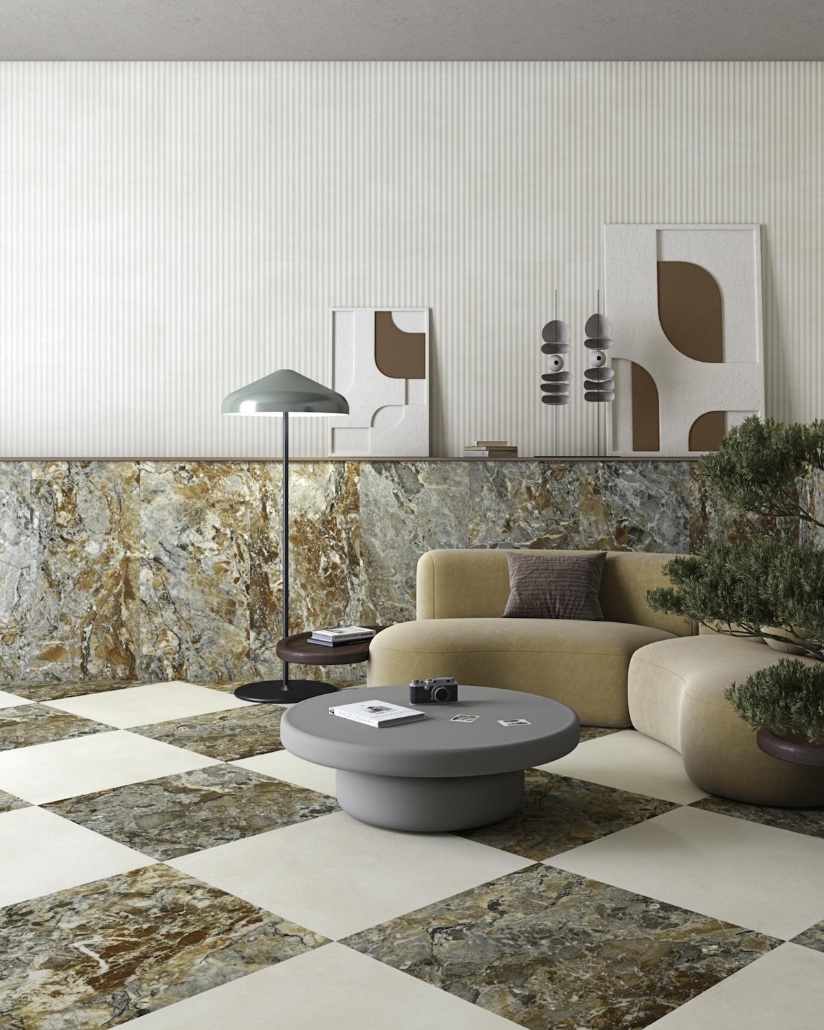
- -15%
- New
The Tandem 80x180 matt marble-effect porcelain tile by Vives brings together three highly distinctive mineral interpretations within a generous, rectangular and clearly architectural format. Tassili-R, Faroe-R and Uyuni-R transfer the visual richness of different natural stones and marbles onto a matt porcelain surface designed to create highly continuous floors and walls.

 Security policy
All payment options are under SSL certificate with encryption
 Delivery policy
We deliver with a flatbed truck to any destination in Spain, France and Belgium. Consult other dest
The Tandem 80x180 matt marble-effect porcelain tile by Vives brings together three highly distinctive mineral interpretations within a generous, rectangular and clearly architectural format. Tassili-R, Faroe-R and Uyuni-R transfer the visual richness of different natural stones and marbles onto a matt porcelain surface designed to create highly continuous floors and walls.
The 80x180 cm format allows veining, layering, chromatic changes and graphic movement to develop across a broad surface. Each piece visually approaches the scale of a large stone slab, reducing the fragmentation created by smaller formats and allowing the design to appear more natural and enveloping.
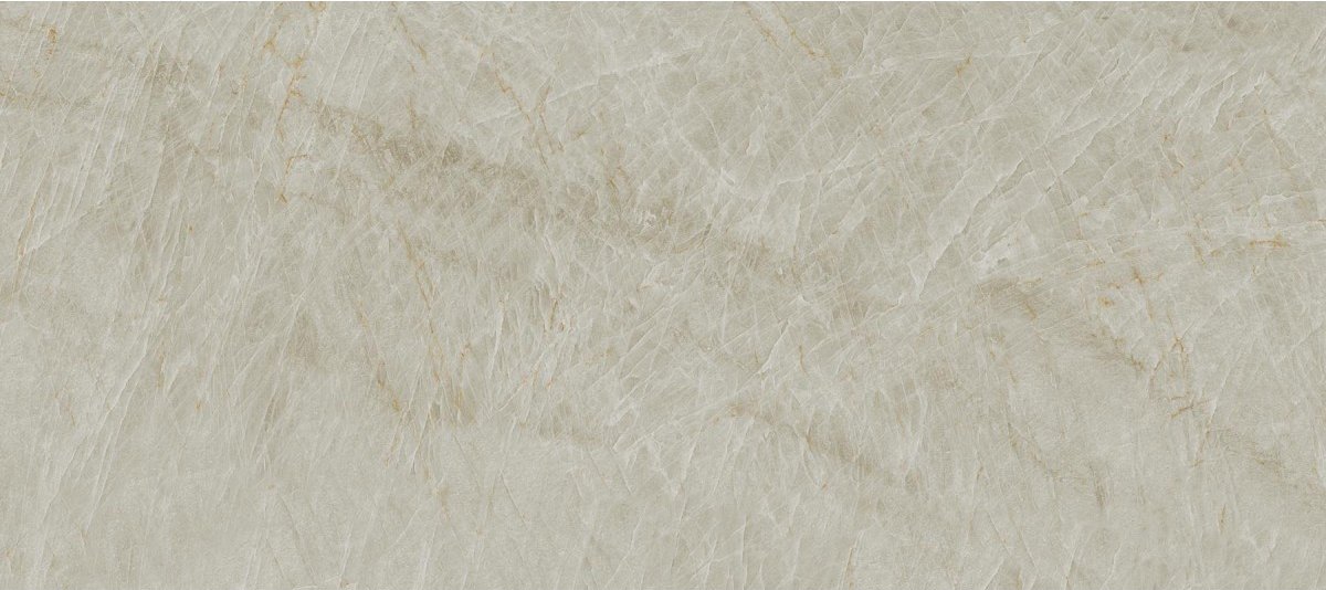
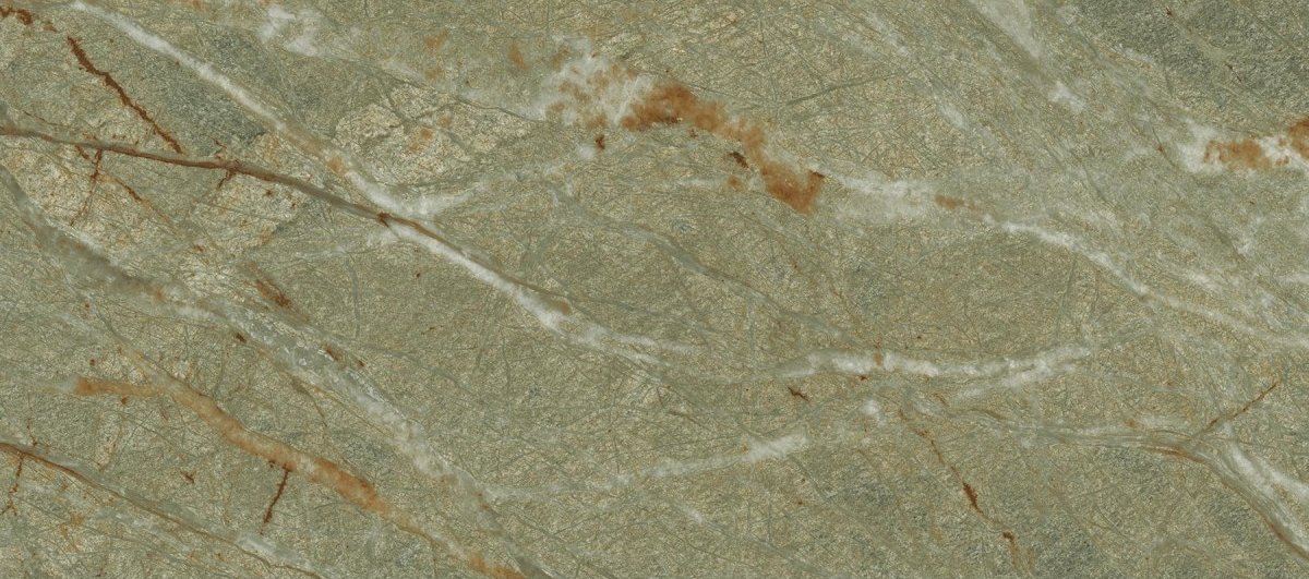
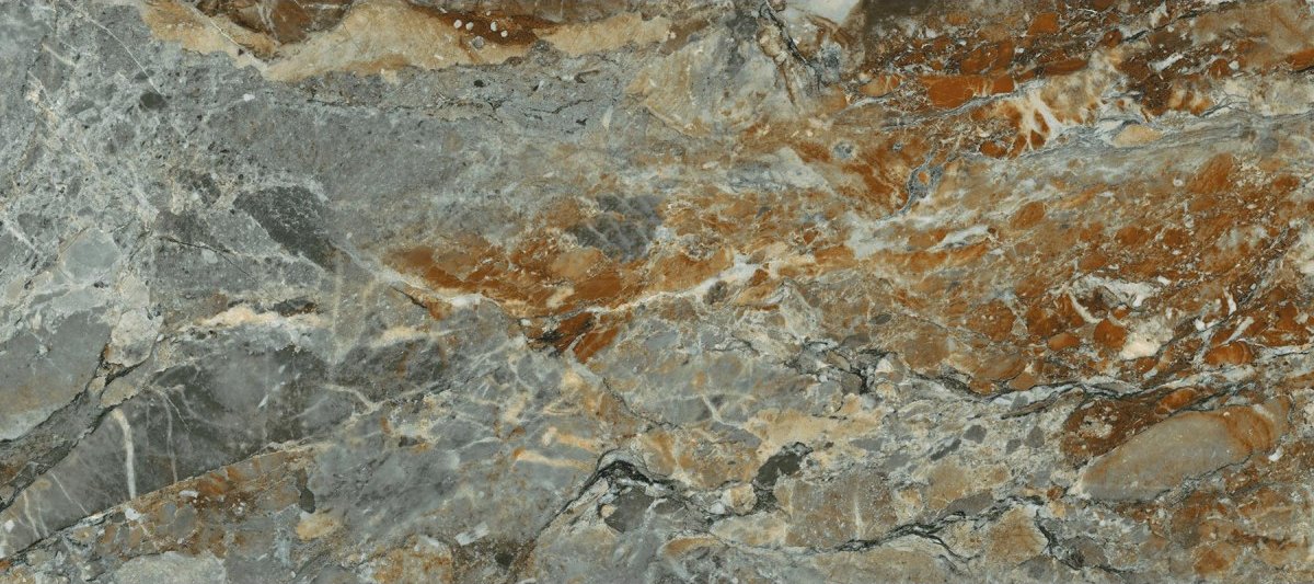
The three references offer very different aesthetics. Tassili-R combines grey, stony shades and intense ochre areas. Faroe-R develops a grey-green surface crossed by warm veining and marked by a strong mineral inspiration. Uyuni-R provides the lightest alternative, with a cream or white base crossed by subtle tonal changes and delicate beige lines. This diversity makes it possible to adapt the 80x180 large format to expressive, natural or bright projects.
The 80x180 cm size provides a scale particularly suited to living rooms, open-plan kitchens, large bathrooms, bedrooms, reception areas, hotels, restaurants and commercial interiors. Its length helps direct the space visually and creates surfaces with a much stronger architectural presence than conventional formats.
On floors, the pieces can be installed along the principal axis of the room to reinforce depth. On walls, the format makes it possible to create large ceramic panels with fewer joints, highlighting the graphic and turning the surface into an essential part of the interior design.
The rectangular proportions also allow the tile to be installed horizontally or vertically. Horizontal placement visually widens walls and reinforces the longitudinal movement of the veins. Vertical installation emphasises height and creates more monumental surfaces, especially in showers, entrance halls and double-height walls.
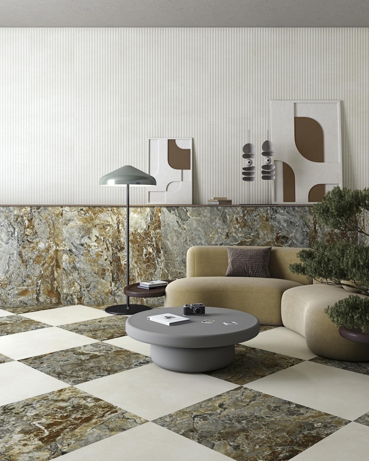
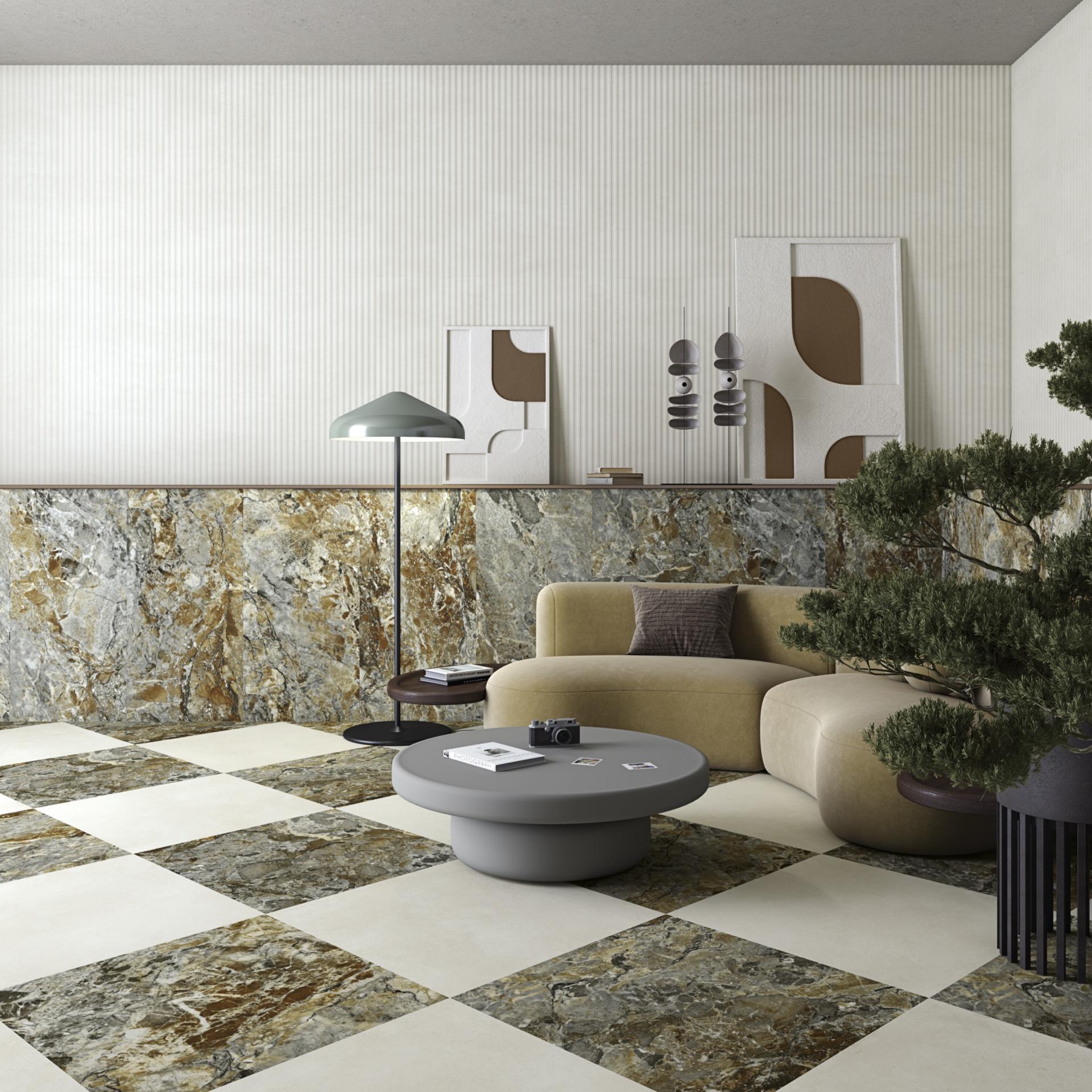
Tassili-R 80x180 is the most intense and expressive of the three interpretations. Its surface combines grey areas, stone-like fragments, white veins and broad ochre or reddish sections. The design recalls a deeply layered natural stone shaped by geological processes and strong chromatic contrasts.
The graphic does not follow a completely uniform direction. Marks, fissures and coloured areas intersect and overlap, creating a dynamic surface that changes from one part of the piece to another. This richness makes Tassili capable of becoming the main feature of a floor or wall without requiring additional decorative elements.
In the 80x180 format, the graphic has enough space to develop without being fragmented. Grey and ochre areas are perceived as large mineral masses, while the veins travel across the piece more naturally, reinforcing the impression of a genuine stone slab.
Tassili works especially well in interiors where a strong material identity is required. It can be used in large living rooms, reception areas, restaurants, hotels and shops where the floor needs to provide character without depending on added decoration.
On a wall, Tassili can become a large stone-effect panel behind a sofa, table, reception desk or freestanding bath. Its graphic intensity allows the amount of furniture to be reduced while the rest of the setting remains relatively restrained.
Combining it with dark timber, black metal, brass, leather, concrete and neutral fabrics creates sophisticated contemporary spaces. The ochre tones also make it possible to introduce furniture or accessories in terracotta, brown, copper and beige.
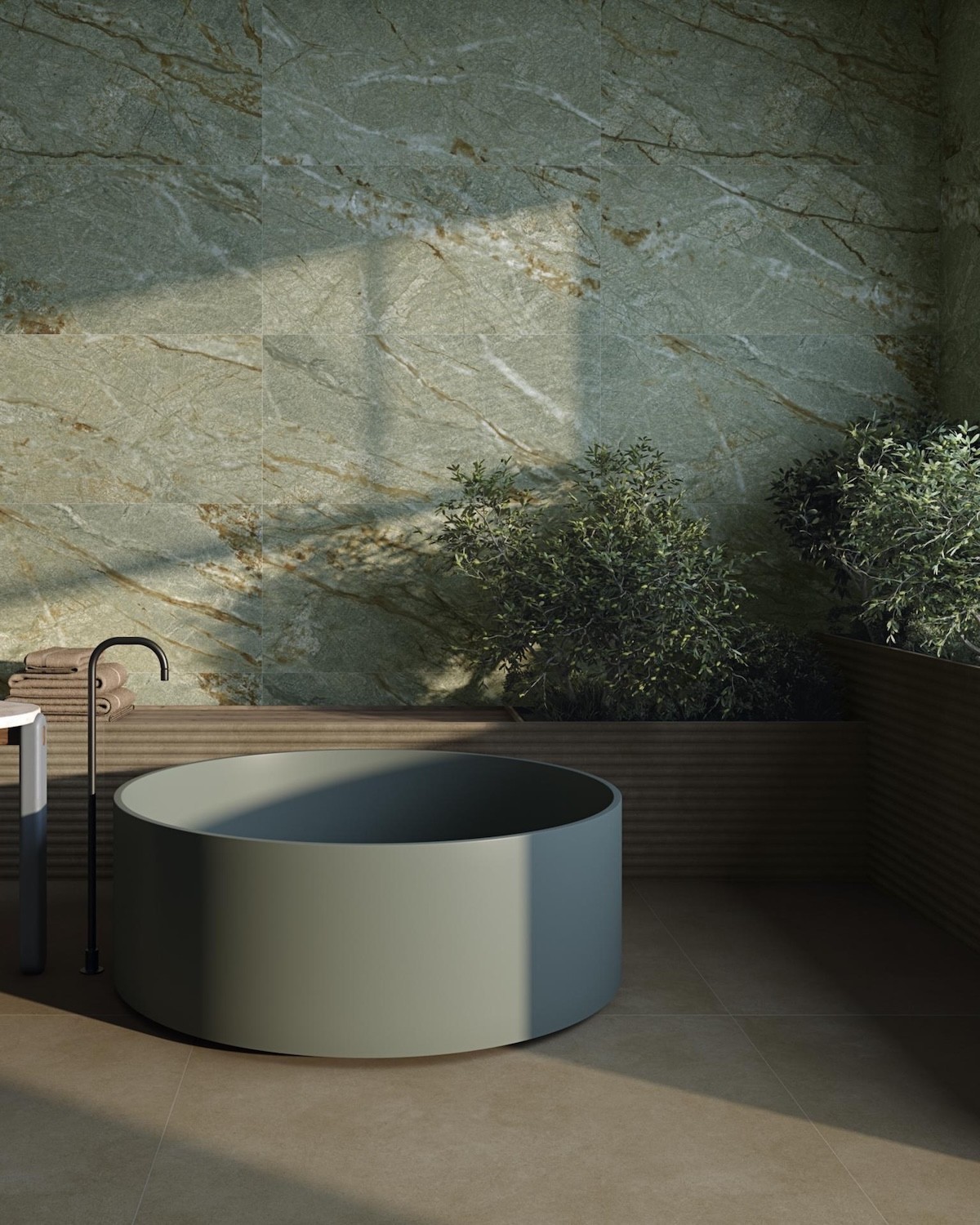
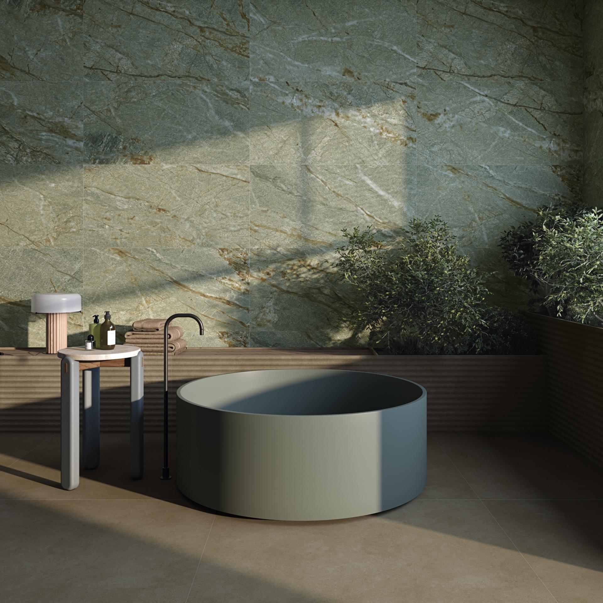
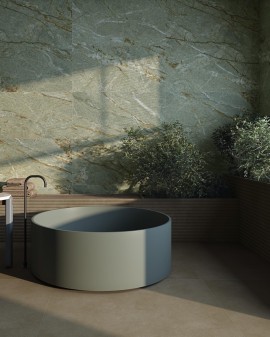
Faroe-R 80x180 develops a calmer, more natural and sophisticated aesthetic. Its base moves between grey-green, sage and stone shades, crossed by beige, ochre and brown veining. The surface recalls selected quartzites and metamorphic stones with considerable depth.
The green does not appear flat or uniform. It is integrated into a mineral structure where changes in intensity, lighter areas and warm lines coexist. This combination makes Faroe an alternative to more conventional white, grey or black marble effects.
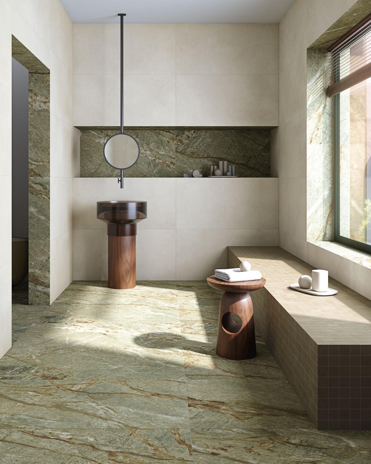
In the 80x180 format, the movement of the veins takes on a broad and continuous appearance. The tile can be used across complete floors or walls, creating environments connected with nature without becoming overly rustic.
Faroe works especially well with timber, woven fibres, pale stone, black metal and brass finishes. Its grey-green palette connects with planting and supports calm, balanced and organically inspired interiors.
In bathrooms, it can cover the main wall, bath area or a large shower. In kitchens, it can be used as flooring or as a decorative background with timber, cream, dark green or black cabinetry.
In hotels, restaurants and wellness interiors, Faroe creates an enveloping and sophisticated atmosphere. Its colour has enough personality to stand out while retaining a mineral base that combines easily with contemporary furniture.
Uyuni-R 80x180 is the lightest and brightest option. Its surface combines off-white, cream, ivory and soft beige shades, accompanied by delicate veining and changes in intensity that add depth without creating excessive contrast.
The design recalls a pale stone with subtle layering. Its restrained graphic allows it to be used across large surfaces without overwhelming the room. It is especially suitable for interiors where brightness, continuity and refined mineral character are required.
The 80x180 format reinforces this sense of openness. The number of joints is reduced and the surface reads as a continuous plane, particularly when the grout colour is selected close to the background of the tile.
Uyuni combines with pale timber, oak, ash, beige stone, natural fabrics, white furniture and black, steel or brass details. Its neutrality allows colour to be introduced through furniture and accessories without the floor restricting the decoration.
In living and dining rooms, it creates a bright and elegant base. In bathrooms, it helps visually enlarge the room and works with white sanitaryware, timber furniture and contemporary fittings.
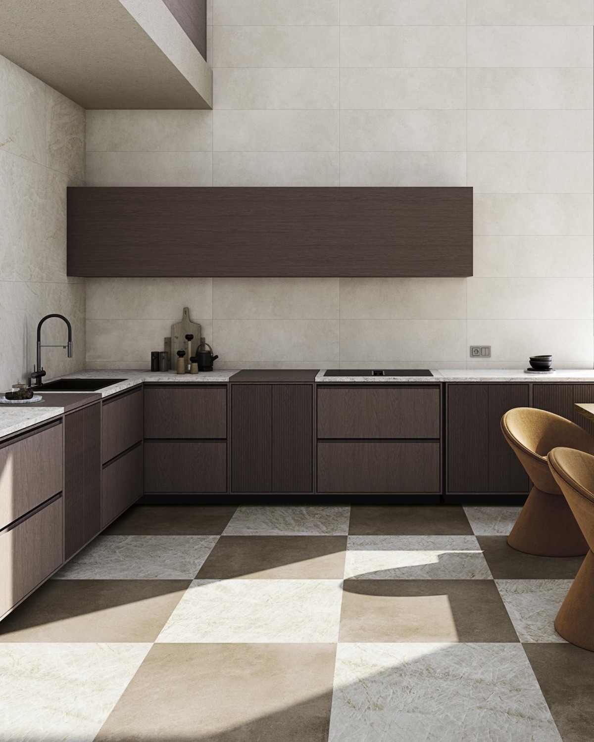
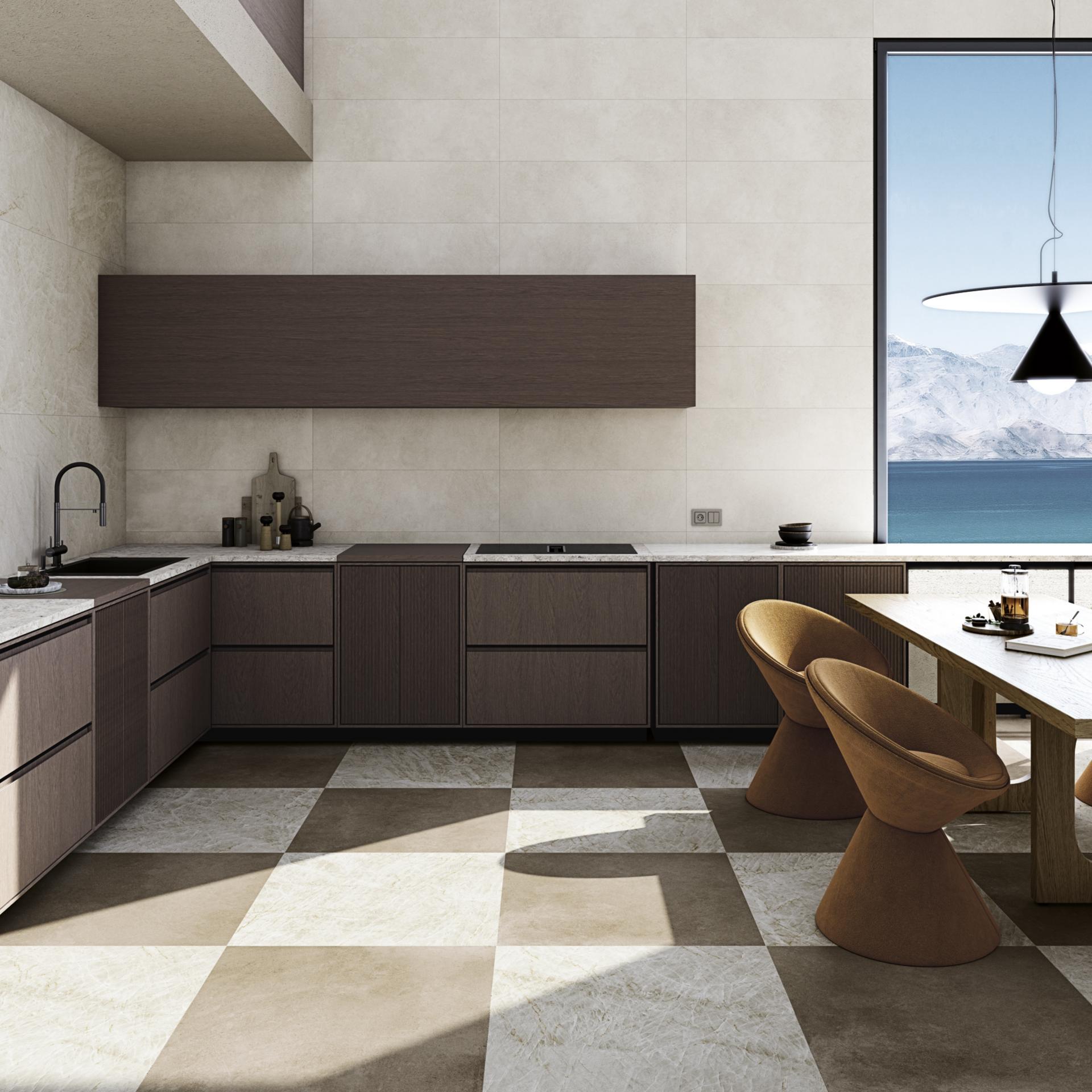
In open-plan kitchens, Uyuni can maintain continuity between the work area, dining room and living space. Its graphic provides enough richness to avoid a flat surface while retaining a discreet presence.
All three references feature a matt finish that transforms the traditional perception of marble. Instead of relying on strong reflections, the surface conveys depth through veining, shade variation and mineral nuances.
This finish makes it easier to integrate Tandem Marble into contemporary, organic, Mediterranean and industrial interiors. The marble effect retains its elegance but acquires a more natural and less classical appearance than polished porcelain.
Light still plays an important role. Frontal illumination softens the graphic, while side lighting helps reveal veins and tonal changes. On Tassili, it strengthens the contrasts. On Faroe, it reveals the green nuances. On Uyuni, it highlights the delicacy of the surface.
The 80x180 format has rectified edges, allowing precise layouts and an ordered reading of the floor or wall. The reduced visual presence of joints helps the graphic appear more continuous.
Rectified edges do not mean the pieces should be installed without joints. The manufacturer’s technical recommendations and the requirements of the substrate, surface and conditions of use must always be respected.
A coordinated grout colour softens the transition between pieces. A contrasting shade makes the rectangular module more visible and can fragment the perception of the stone, so the result should ideally be checked using a sample before making a final decision.
Tandem Marble 80x180 pieces have an 11 mm thickness and are sold individually. Each box contains one piece and covers 1.44 m².
This packaging must be considered when calculating the order. The required quantity will depend on the net surface area, layout, perimeter cuts and selected direction.
With large formats, it is advisable to include a sufficient allowance for cuts, graphic selection and possible future replacement. An installation plan helps optimise the material and avoid narrow or unbalanced cuts in visible areas.
In living rooms, dining rooms and open-plan interiors, the 80x180 format creates highly continuous flooring. The length of the piece helps direct the eye and visually connect different functions within the same room.
Tassili creates highly expressive floors and functions as the principal decorative feature. Faroe introduces a mineral, natural and sophisticated atmosphere. Uyuni creates a bright base that integrates easily into spacious and calm interiors.
Furniture can follow the direction of the pieces to reinforce architectural order. Tables, sofas and kitchen islands may be aligned with the longitudinal axis of the format.
Tandem Marble 80x180 porcelain can also be used as a wall covering. Its large scale creates slab-effect walls with fewer joints and a much more continuous graphic.
In living rooms, it can cover a television wall, fireplace or decorative panel. In bedrooms, it can become a ceramic headboard. In entrance halls and hotels, it creates high-impact backgrounds for receptions and waiting areas.
Tassili introduces drama, Faroe provides a natural interpretation and Uyuni brings clarity and softness. The choice depends on how prominent the surface should become.
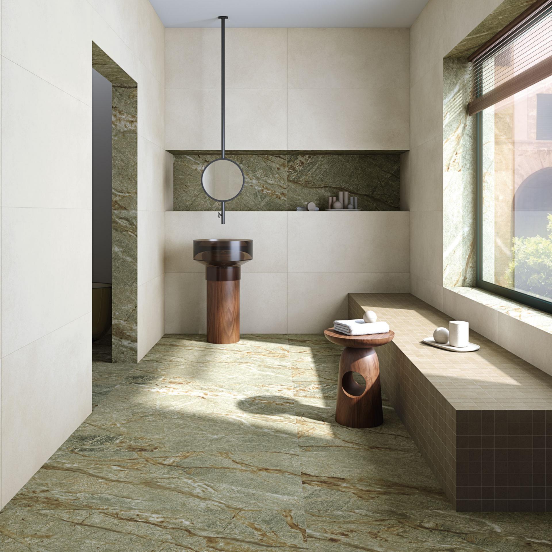
In bathrooms, the 80x180 format reduces the number of joints and allows broad continuous planes to be created. It can be used on floors, principal walls, basin areas and surfaces close to baths.
Uyuni supports bright and relaxing bathrooms. Faroe creates an atmosphere connected with nature and works particularly well with timber. Tassili turns the surface into an intense and exclusive decorative feature.
The selection of material for areas directly exposed to water must consider use, slope and the required anti-slip characteristics. Aesthetic appearance does not replace the technical assessment of each area.
In kitchens, the porcelain can be used as highly continuous flooring and extended into the dining and living areas. This strategy helps unify open spaces and avoids unnecessary visual divisions.
Uyuni combines with white, cream, pale timber and black cabinetry. Faroe works with timber, green, beige and graphite furniture. Tassili stands out alongside plain cabinetry and surfaces with a controlled colour palette.
When the floor has an intense graphic, calmer worktops and splashbacks are advisable. In projects where the floor is softer, as with Uyuni, other decorative elements can be introduced more freely.
The 80x180 format is particularly suitable for hotels, restaurants, shops and reception areas where a strong surface with fewer joints is required.
Tassili can be used in restaurants, urban hotels and shops seeking an expressive identity. Faroe works in spas, nature-inspired hotels and wellness-focused establishments. Uyuni brings brightness to receptions, boutiques and refined commercial interiors.
All three references maintain an elegant mineral identity without relying on figurative motifs or short-lived trends.
Timber softens the presence of the marble effect and creates a balanced relationship between a mineral surface and a warm material. Tassili combines with walnut, dark oak and smoked woods. Faroe works with oak, ash and medium shades. Uyuni relates naturally to pale and untreated timber.
The combination can be introduced through furniture, cladding, doors, panelling and structural elements. The direction of the timber grain can follow or contrast with the movement of the porcelain.
In larger interiors, alternating timber and porcelain makes it possible to differentiate areas while maintaining a coherent palette.
Black metal reinforces the architectural character of all three models. Brass and bronze combine especially well with the ochre veining in Tassili and Faroe. Steel and aluminium bring a cleaner, more contemporary appearance to Uyuni.
Pale stones can be used alongside Tassili to balance its intensity. Faroe combines with limestone, travertine and beige stone. Uyuni can coexist with white, cream and soft grey surfaces.
The composition should avoid an excessive accumulation of strong graphics. When Tandem Marble covers a large area, more uniform complementary materials are generally preferable.
Graphic variation forms an essential part of these pieces. Veins, colour changes and mineral areas should not be considered defects, but design resources intended to avoid artificial repetition.
Before installation, it is advisable to open several boxes and lay out the pieces. With Tassili, grey and ochre zones should be balanced. With Faroe, the warm veins and different green nuances should be distributed. With Uyuni, pale areas and beige lines should be alternated.
This preparation helps create a more natural surface and prevents several highly intense zones from being concentrated unintentionally.
Handling 80x180 cm pieces requires appropriate tools, transport systems, suction cups and professionals experienced in large-format tiles.
The substrate must be flat, stable and correctly prepared. Adhesive application should provide uniform coverage to prevent voids beneath the tile and ensure secure installation.
Direction, cuts and layout should be studied before work begins. A preliminary plan helps centre the pieces, balance perimeter cuts and relate the graphic to doors, windows and furniture.
Tassili-R, Faroe-R and Uyuni-R 80x180 are porcelain pieces suitable for installation on both floors and walls. This versatility makes it possible to use the same graphic across several planes and create enveloping interiors.
The material is also classified as frost resistant, although suitability for outdoor use must be assessed according to location, moisture, slope and specific anti-slip requirements.
Frost resistance does not mean that the matt surface is suitable for every wet outdoor area. Each application requires an appropriate technical assessment.
After installation, a suitable final clean should be carried out to remove cement, adhesive and grout residues. The products used must be compatible with porcelain stoneware.
For routine maintenance, systems that do not leave films capable of altering the matt appearance are recommended. Cleaning frequency will depend on traffic and the type of space.
In hotels, restaurants and shops, maintenance should be adapted to more intensive use while avoiding products that visually alter the veining or leave residues on the surface.
The Tandem 80x180 matt marble-effect porcelain tile by Vives brings together three designs capable of responding to very different projects. Tassili-R offers a dramatic surface where grey and ochre create a highly expressive graphic. Faroe-R introduces a mineral green palette crossed by warm veining. Uyuni-R brings brightness through a pale and delicately layered base.
The rectified 80x180 cm format allows the graphic richness to be appreciated with greater continuity, reduces fragmentation and creates floors and walls with a clearly defined architectural presence.
Its matt finish, 11 mm thickness, porcelain construction and suitability for floors and walls make these pieces an option for homes, living rooms, kitchens, bathrooms, hotels, restaurants, shops and representative spaces. Tandem Marble 80x180 does not act merely as a wall or floor covering, but as a large mineral surface capable of defining the overall character of the project.
Data sheet
No customer reviews for the moment.
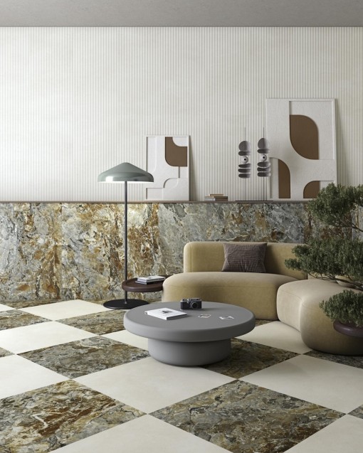
The Tandem 80x180 matt marble-effect porcelain tile by Vives brings together three highly distinctive mineral interpretations within a generous, rectangular and clearly architectural format. Tassili-R, Faroe-R and Uyuni-R transfer the visual richness of different natural stones and marbles onto a matt porcelain surface designed to create highly continuous floors and walls.